Initial Research:
Because the target audience for this brand will be young adults (approx. 18-35), I started out by looking at modern alcohol packaging. More limited colour palettes / black and white heavy colour schemes often look more sophisticated and expensive to me, and I would like this to be more of a fun casual brand, not for people who are vodka connoisseurs.
Because the target audience for this brand will be young adults (approx. 18-35), I started out by looking at modern alcohol packaging. More limited colour palettes / black and white heavy colour schemes often look more sophisticated and expensive to me, and I would like this to be more of a fun casual brand, not for people who are vodka connoisseurs.
Thoughts:
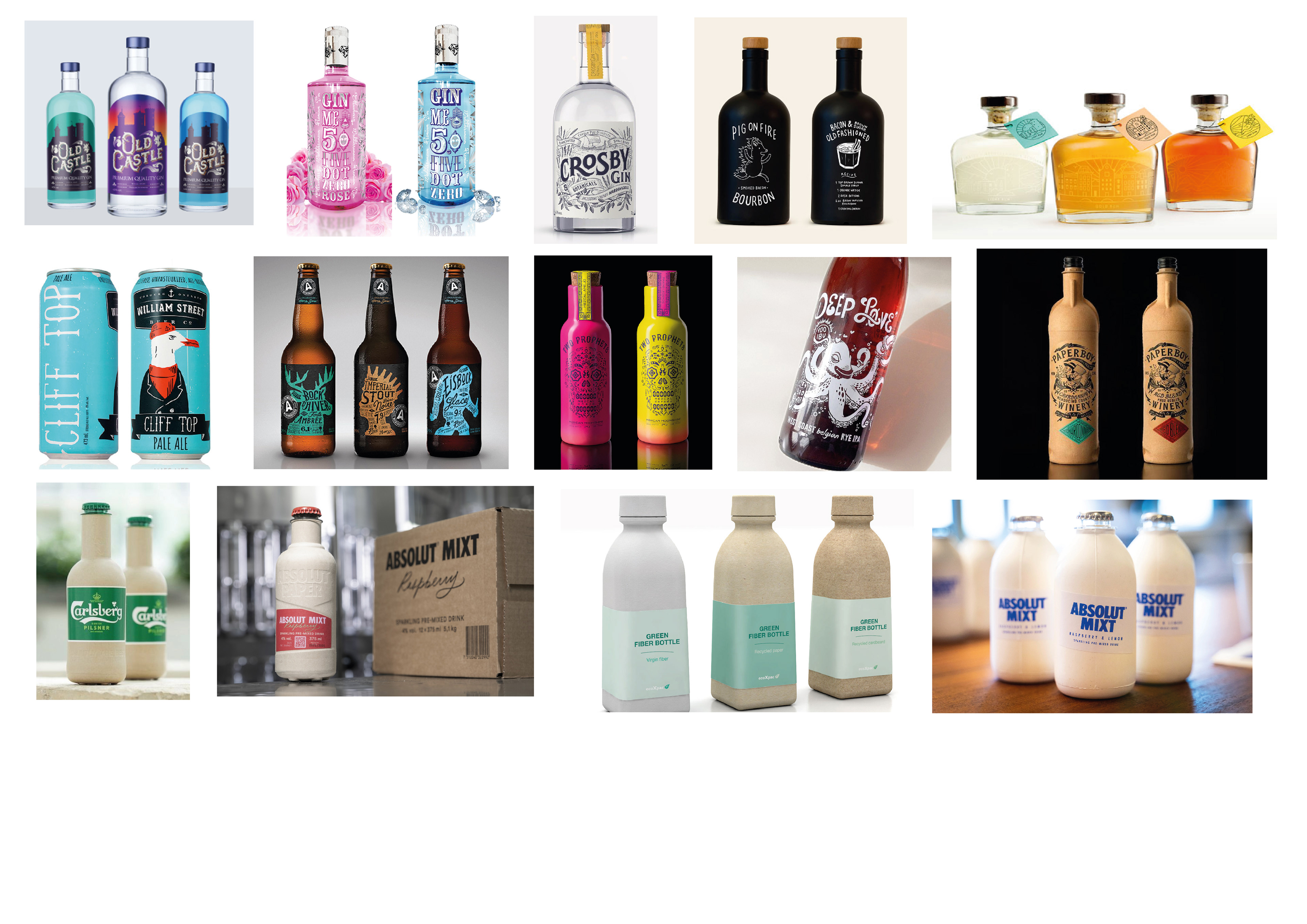
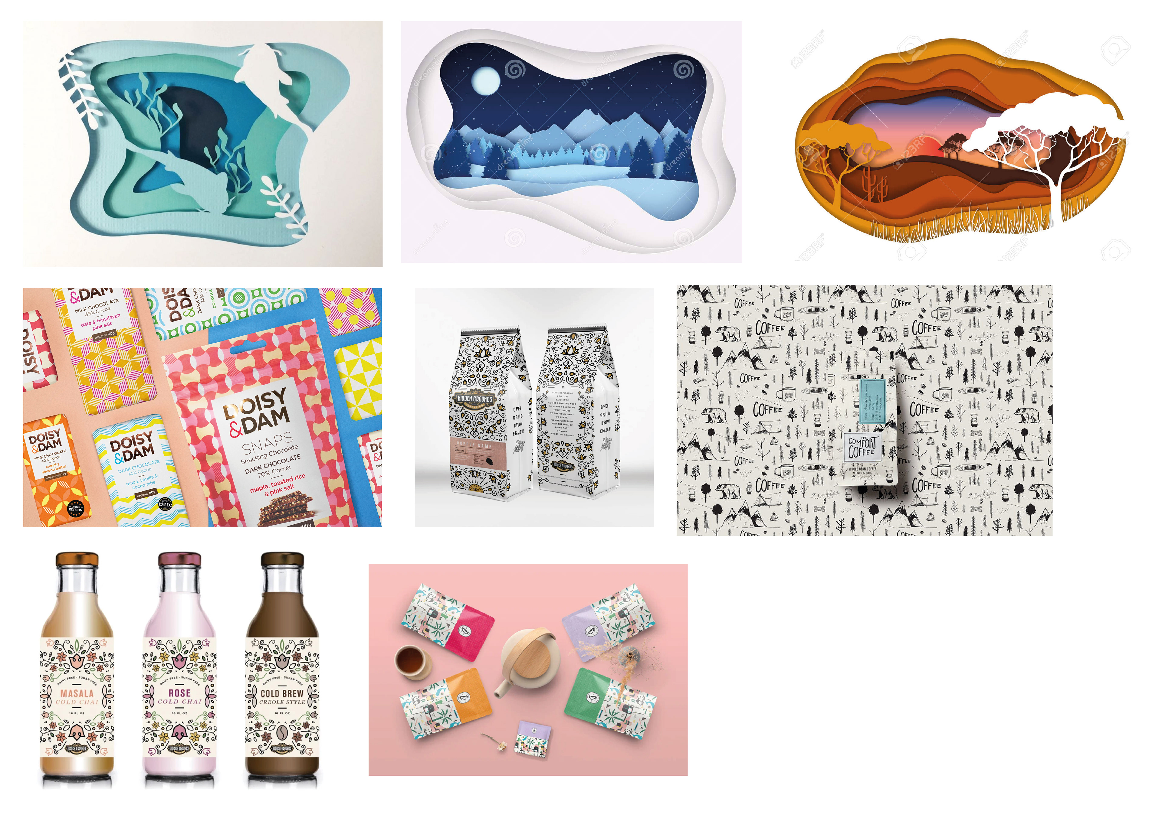
The packaging with the hands casting shadows on the back of the bottle made me think about how I can utilise the fact that the liquid will be clear, and play with different layers on the packaging. It reminded me of layered paper art and landscapes shown in the images below. I also think pattern would be an interesting approach to the packaging, as well as something very minimal and typographic. I looked at both traditional glass packaging, and also cardboard bottles which have recently started being prototyped by other alcohol companies.
The packaging with the hands casting shadows on the back of the bottle made me think about how I can utilise the fact that the liquid will be clear, and play with different layers on the packaging. It reminded me of layered paper art and landscapes shown in the images below. I also think pattern would be an interesting approach to the packaging, as well as something very minimal and typographic. I looked at both traditional glass packaging, and also cardboard bottles which have recently started being prototyped by other alcohol companies.
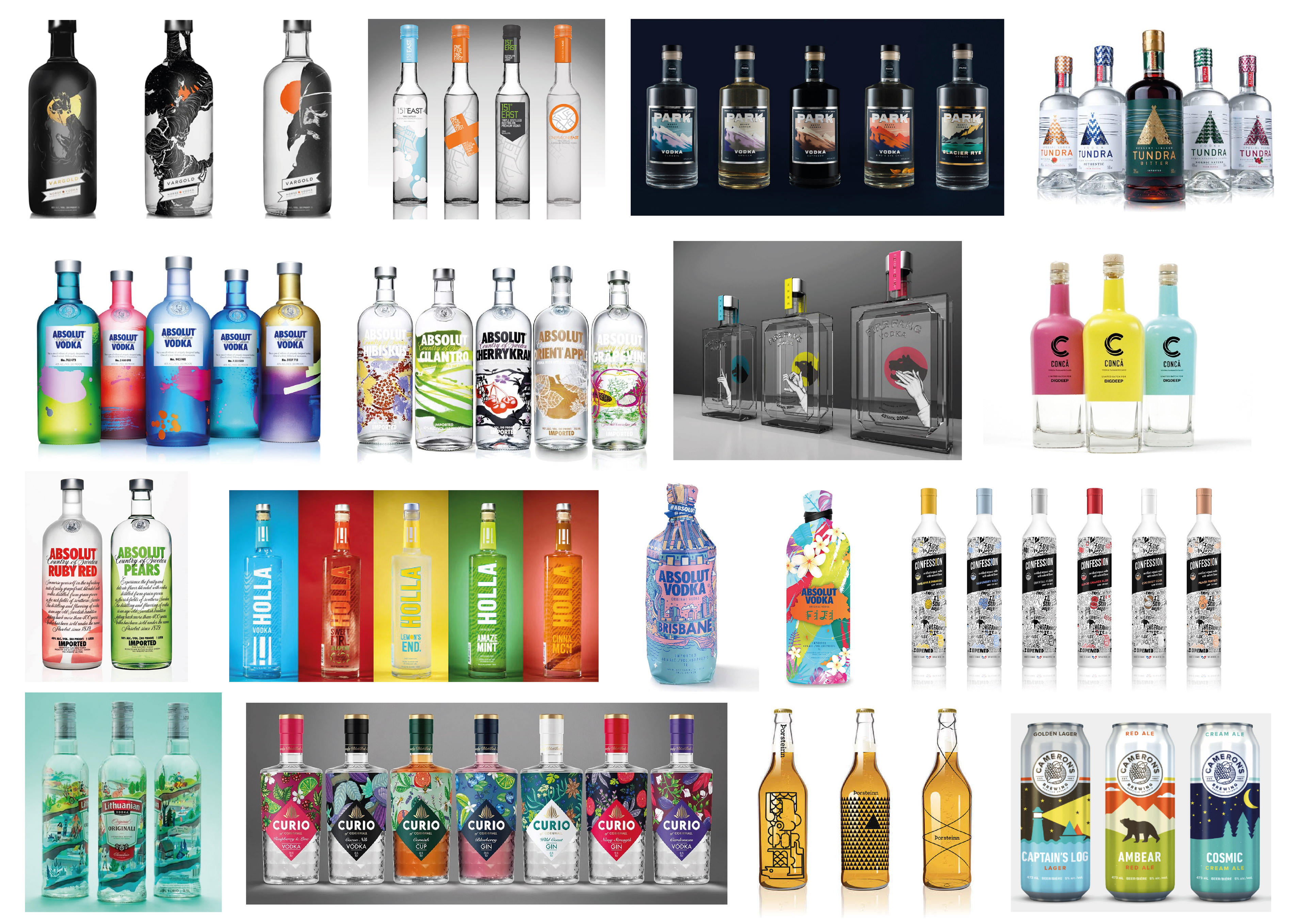
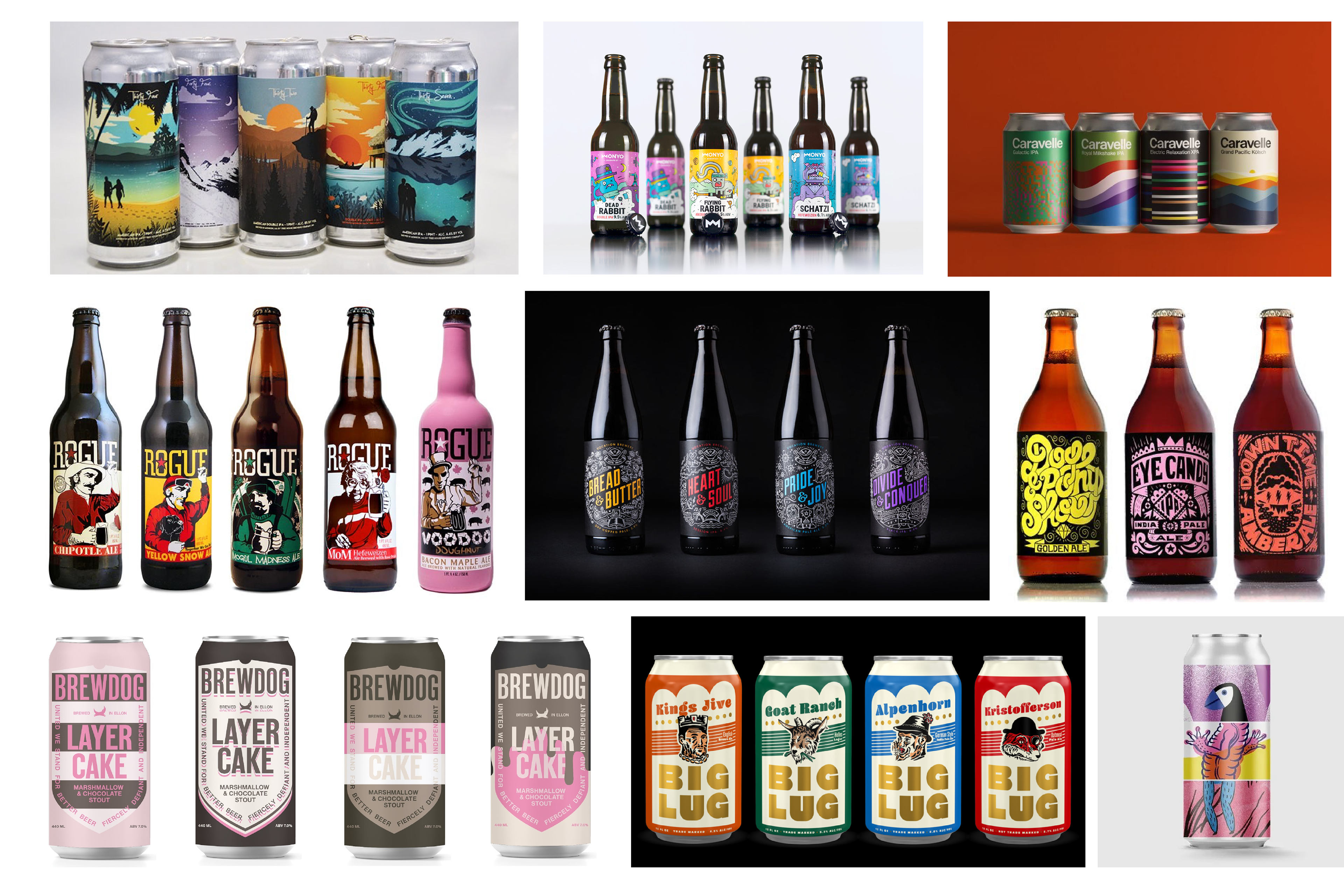
Competitors on shelf


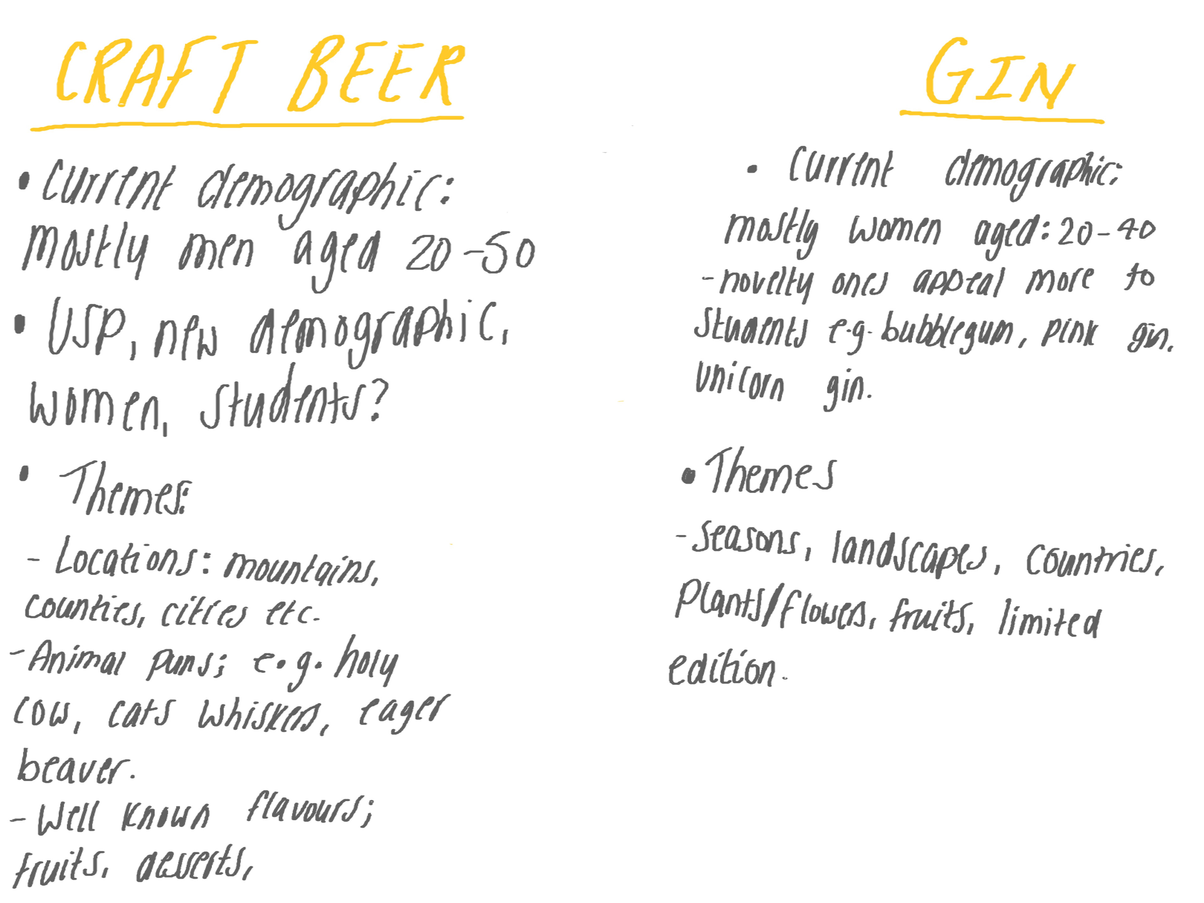
New Direction
After feedback and doing some more research, I decided to change my brief so that I would have more of a 'design challenge' to work towards so I could produce an outcome more easily as it would have more of a purpose.
I decided to change my brief to creating packaging for craft beer, and somehow making it appeal more towards women instead of the typical male dominant demographic for these products.
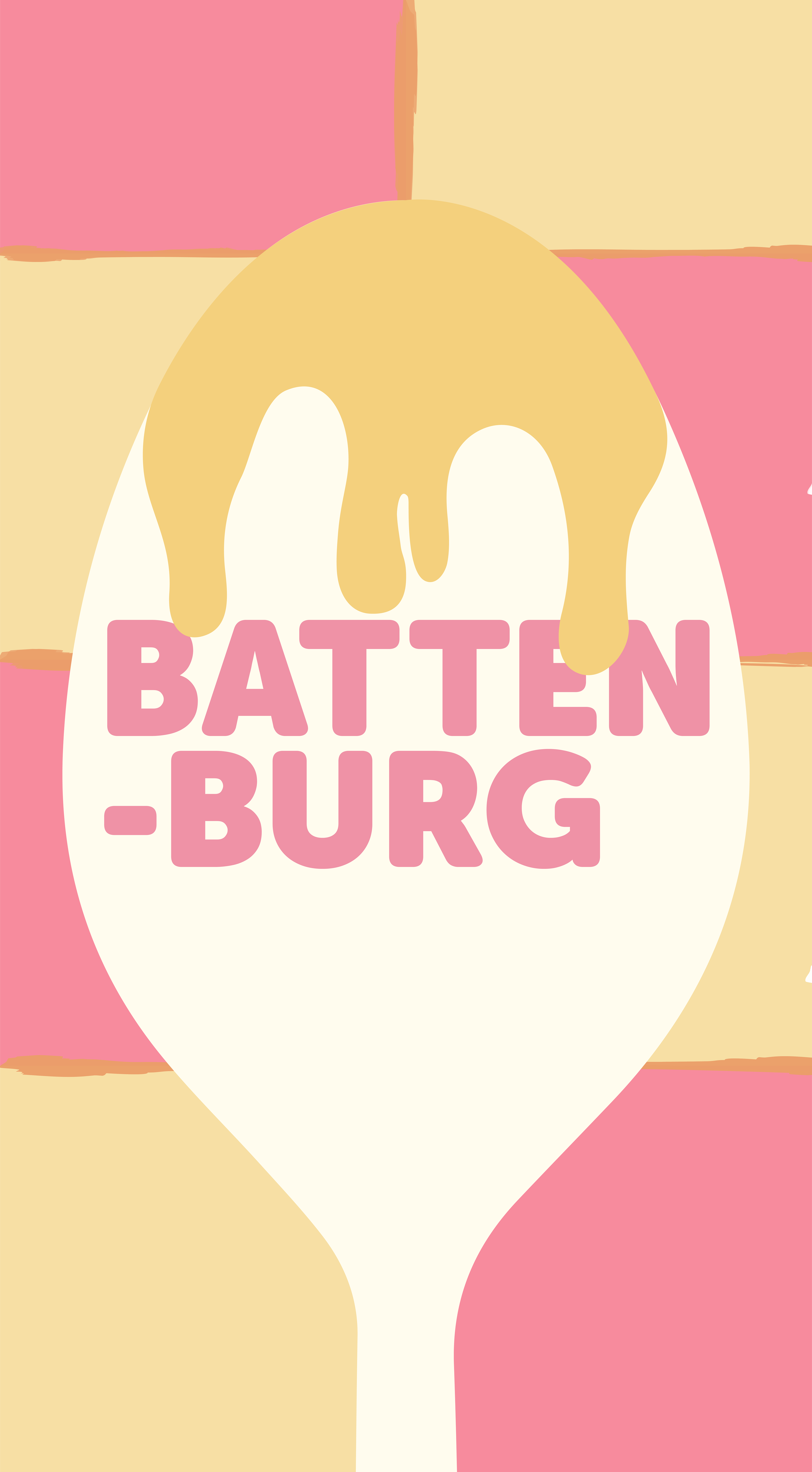
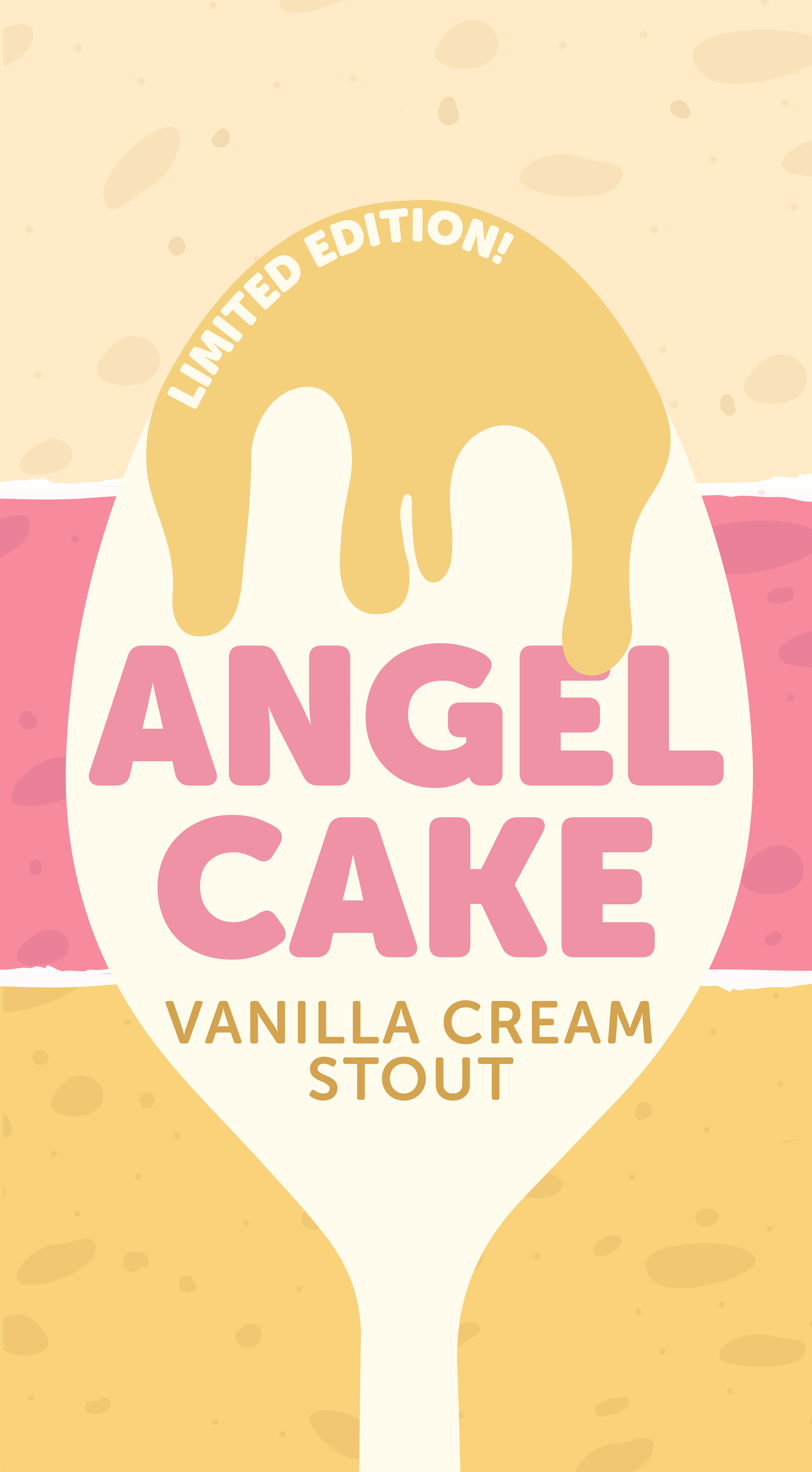
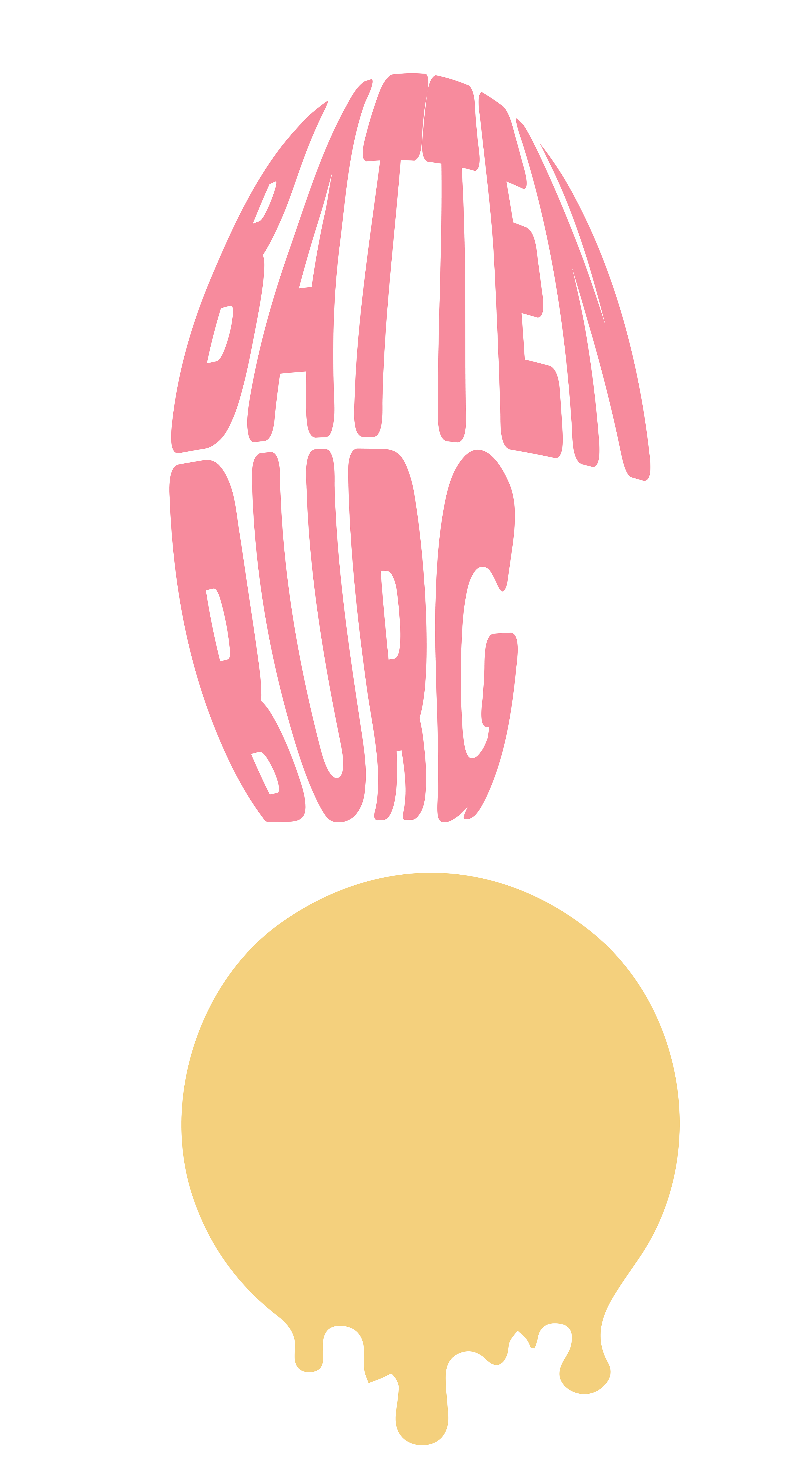
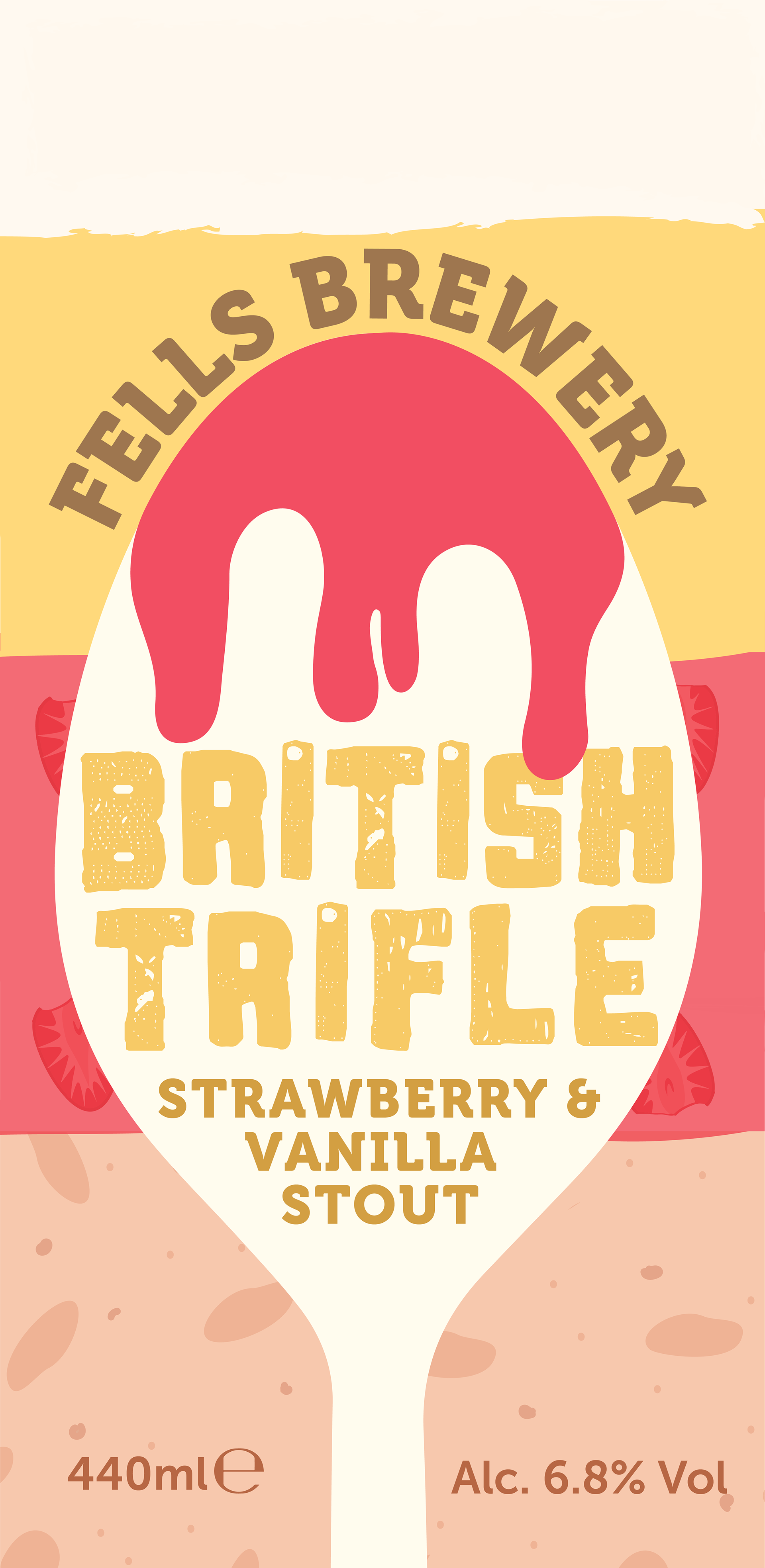
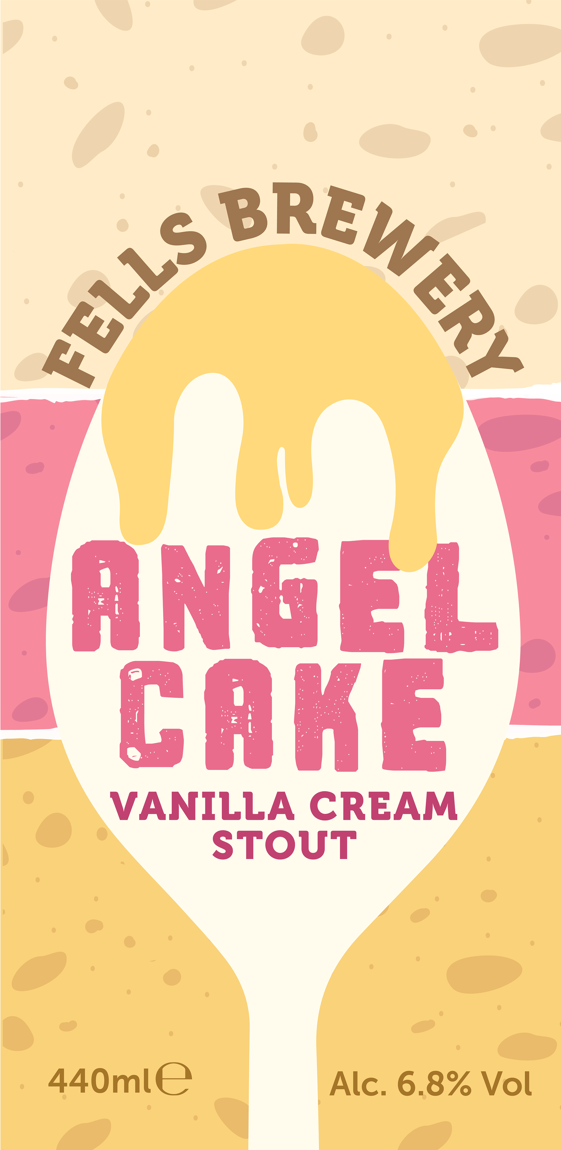
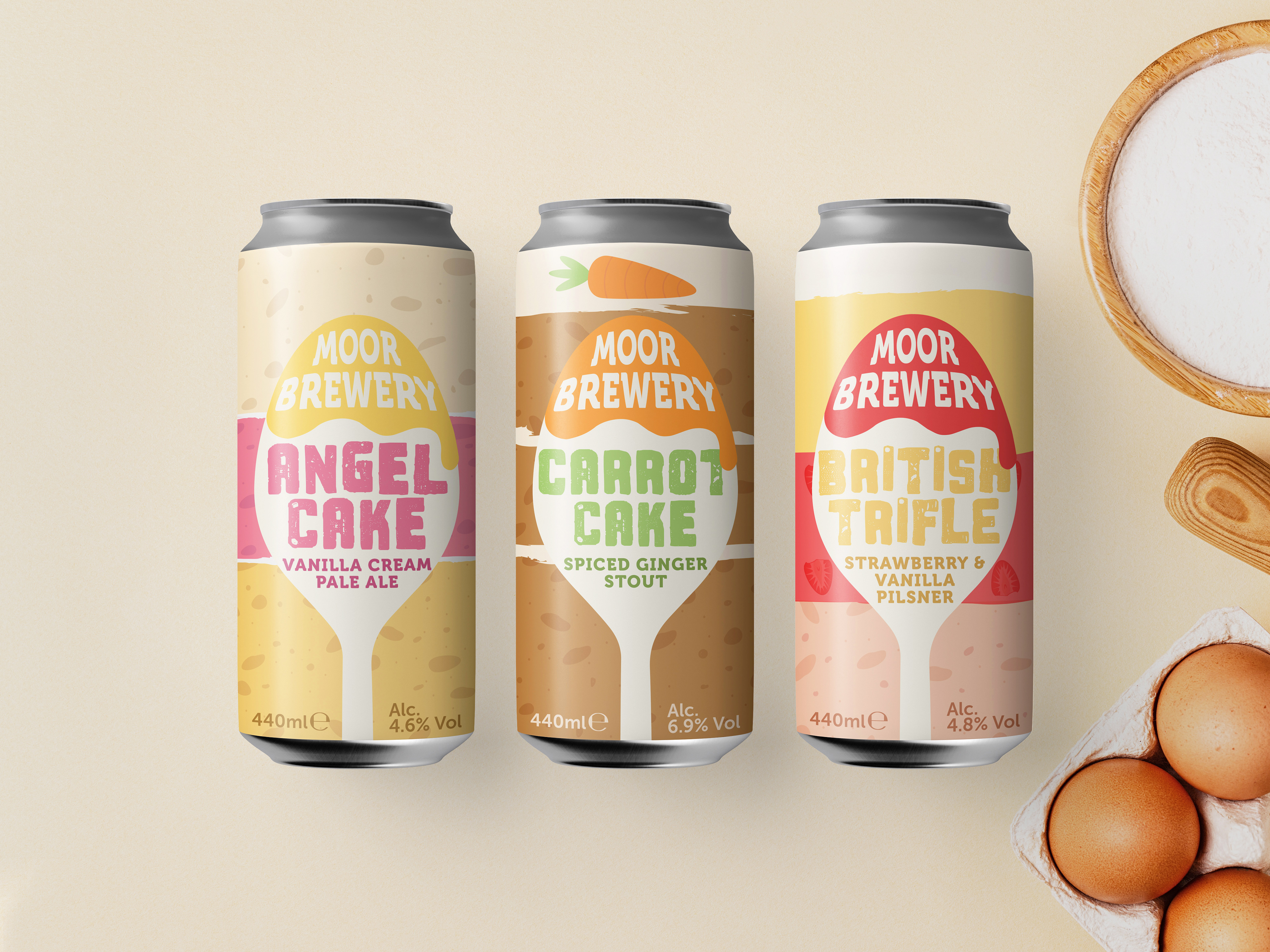
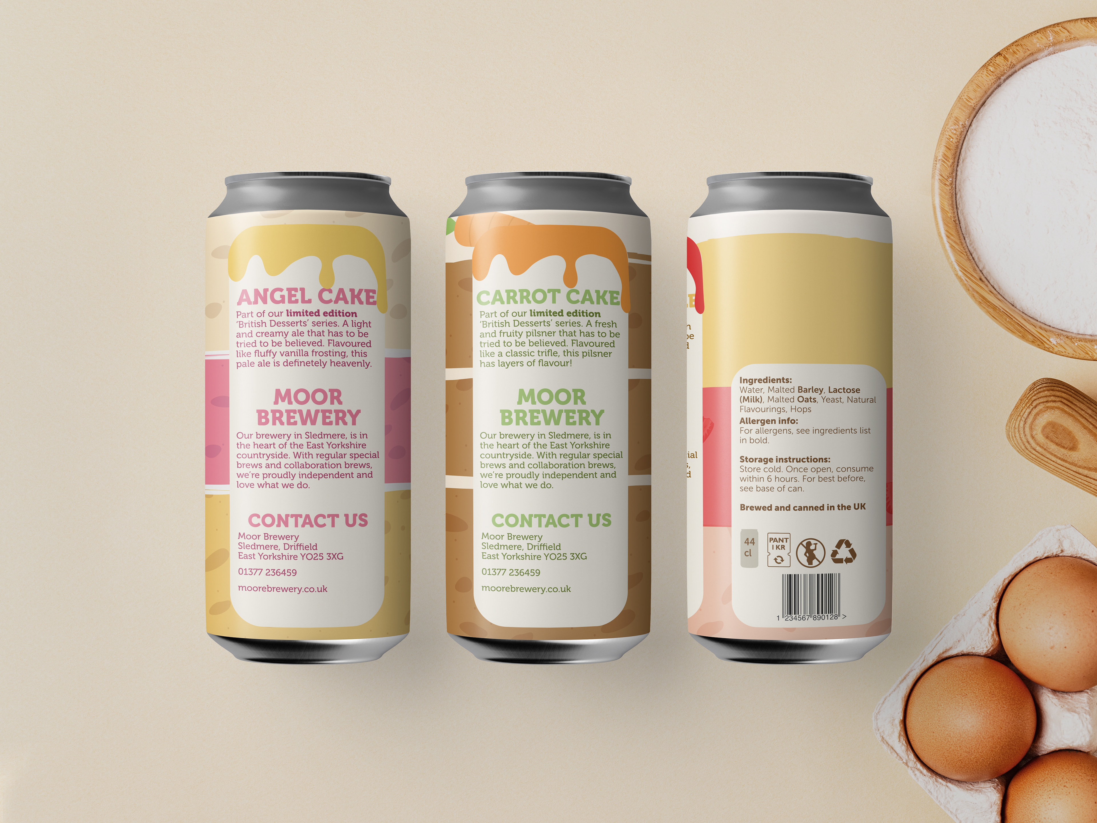
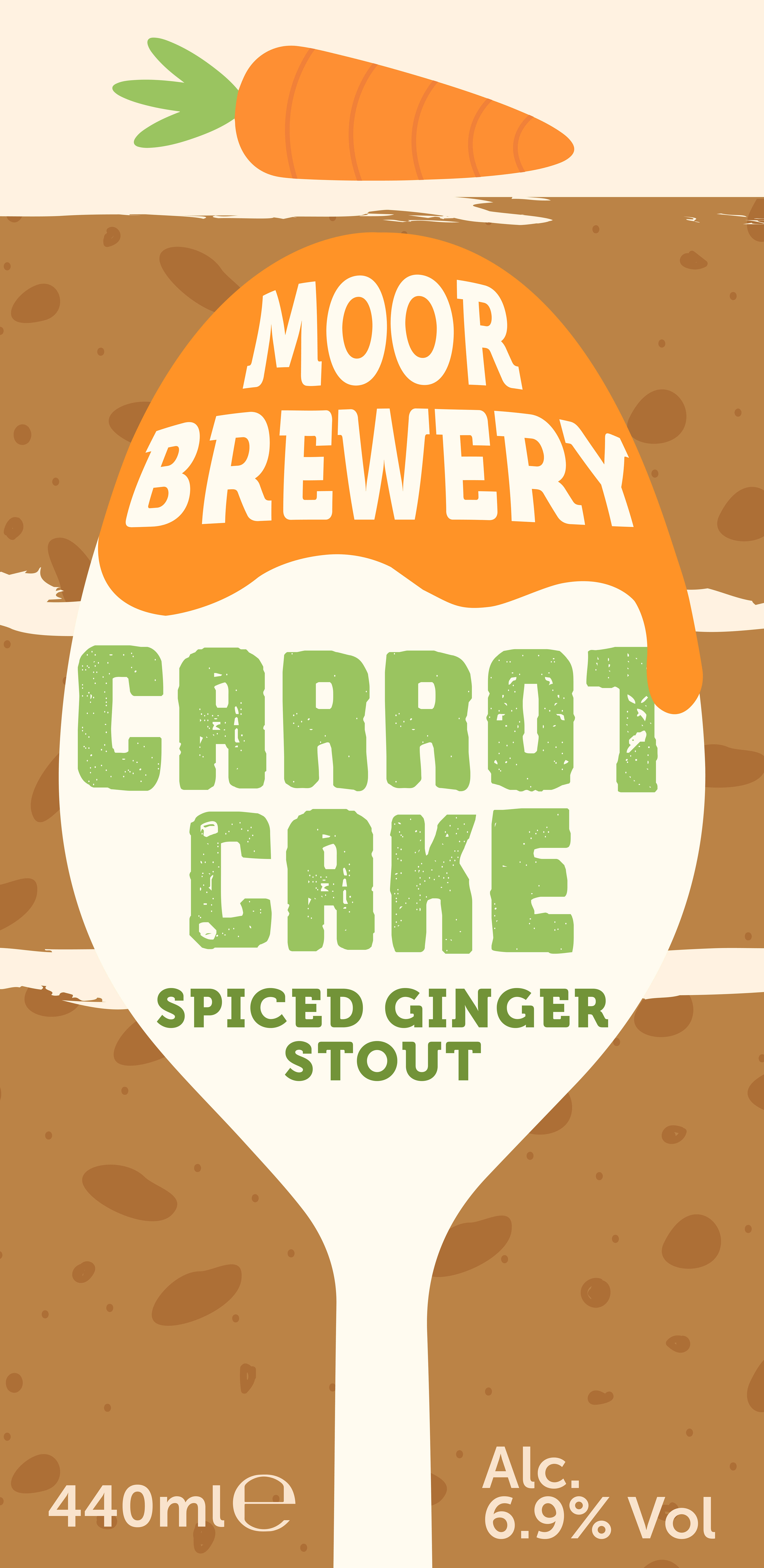
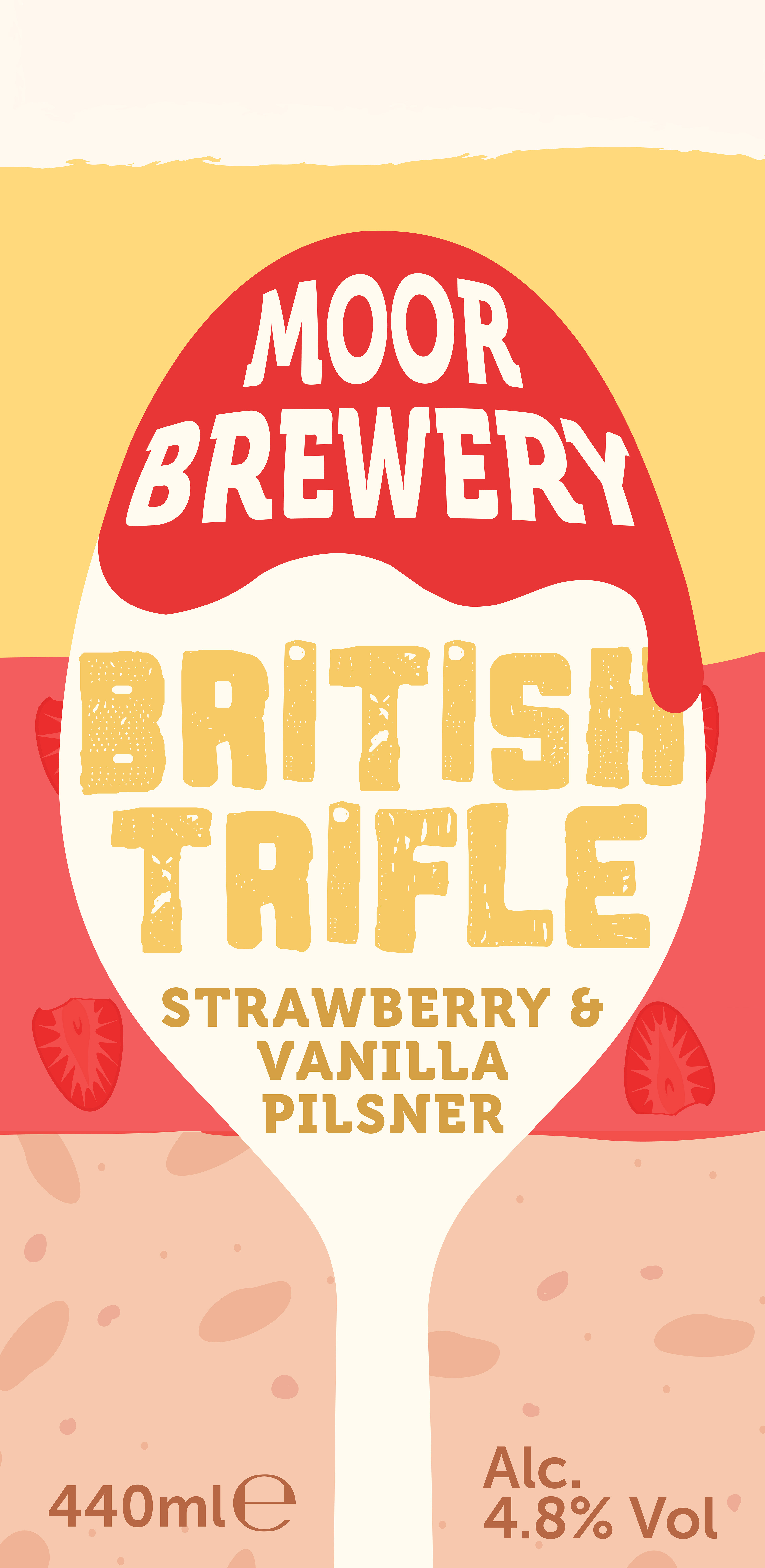
Final Designs
My final outcomes are a series of flavours based on desserts, as I feel like these softer flavours and baking is more appealing to a female target demographic, but still without completely excluding the existing male demographic. These flavours and themes also allow for softer and more 'feminine' colours and imagery to be used.
My final outcomes are a series of flavours based on desserts, as I feel like these softer flavours and baking is more appealing to a female target demographic, but still without completely excluding the existing male demographic. These flavours and themes also allow for softer and more 'feminine' colours and imagery to be used.