Initial Research:
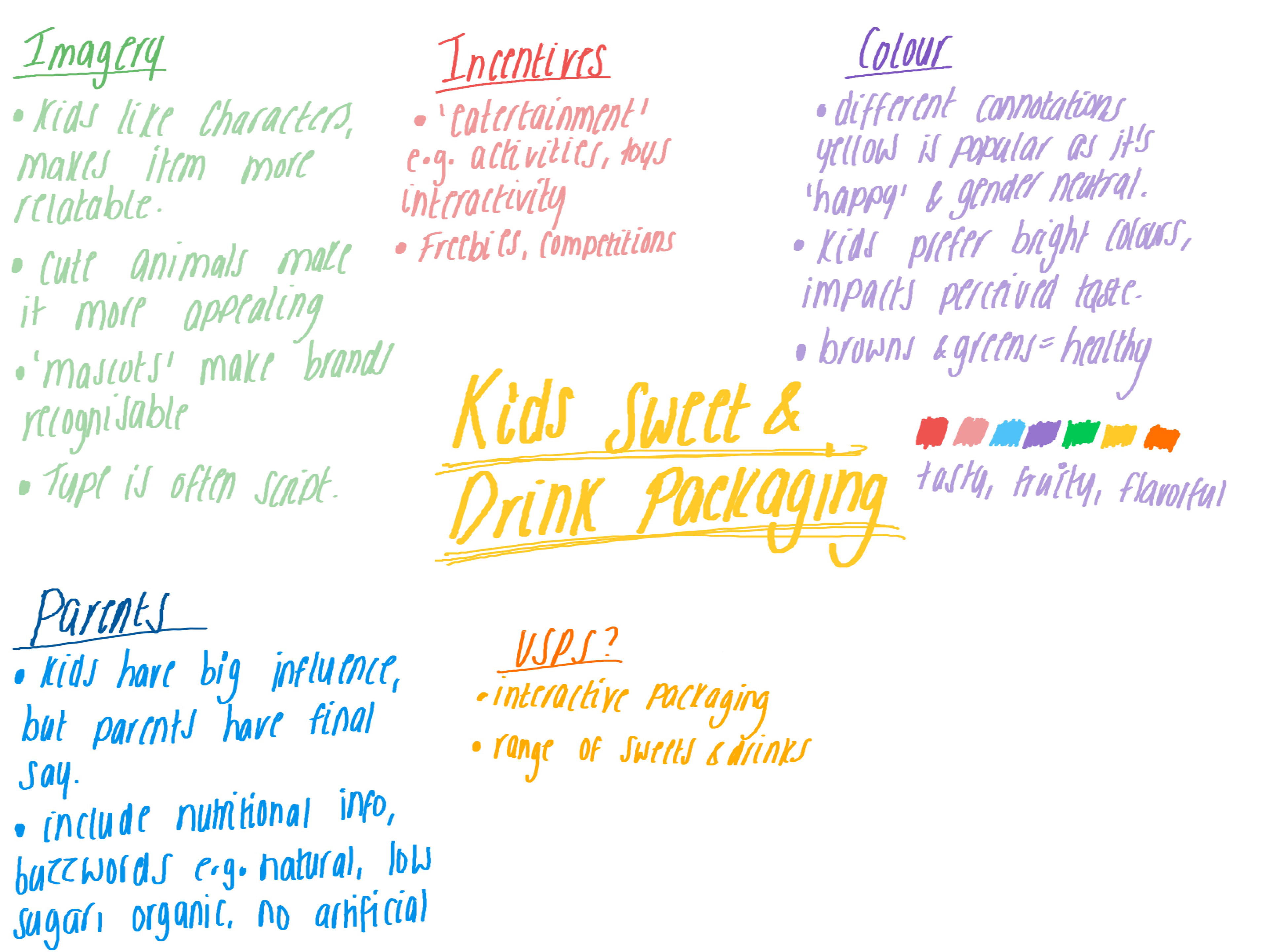
I started out by looking at packaging that I like from similar products on the market. I want to keep with the theme of using characters and bright colours, as research and studies from my dissertation show that children greatly favour products with these features, so the product I create will need to have a different kind USP that can allow this product complete with others, such as; unique shaped packaging, interactive packaging, or some kind of incentive.
I started out by looking at packaging that I like from similar products on the market. I want to keep with the theme of using characters and bright colours, as research and studies from my dissertation show that children greatly favour products with these features, so the product I create will need to have a different kind USP that can allow this product complete with others, such as; unique shaped packaging, interactive packaging, or some kind of incentive.

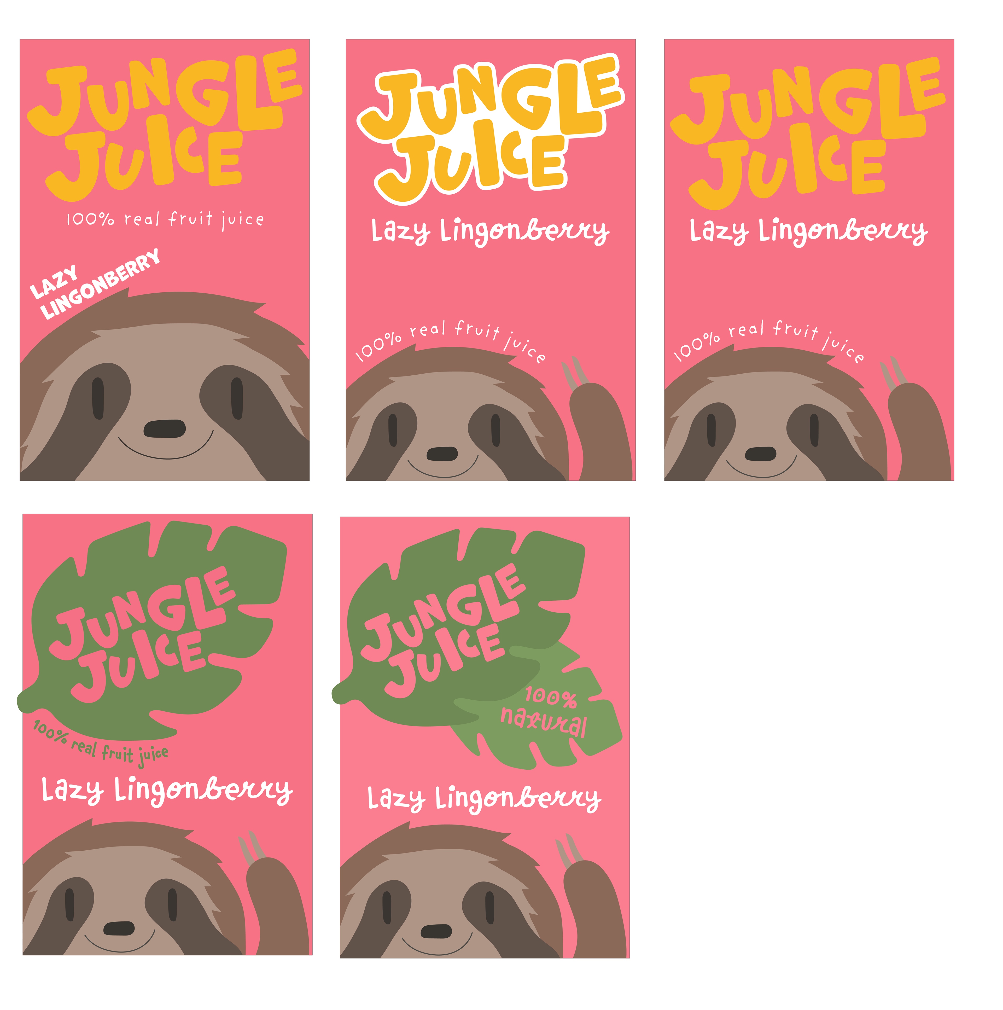
Next Steps:
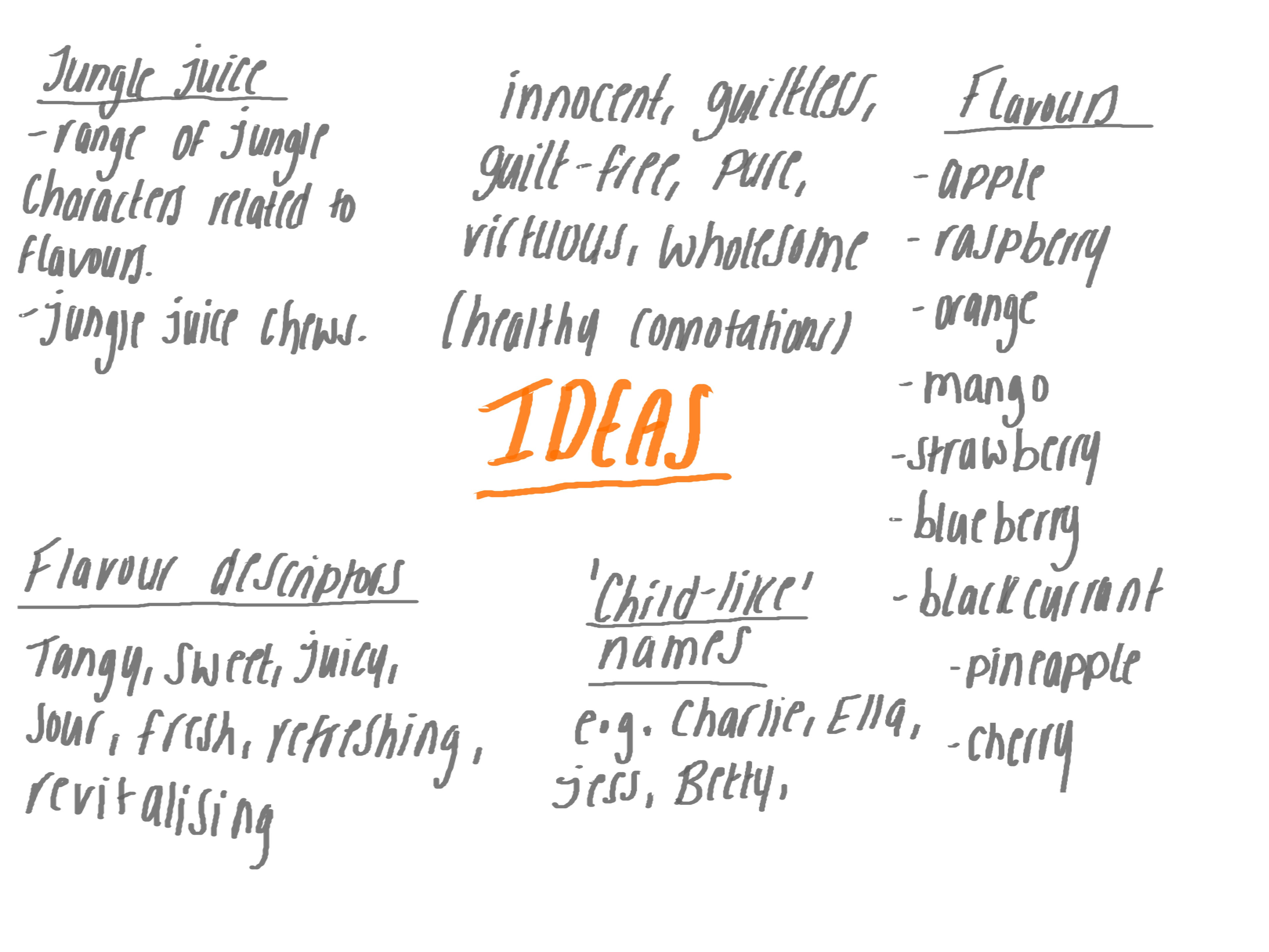
- Consider more names, 'Jungle Juice' refers to an alcoholic cocktail so isn't suitable for the target audience.
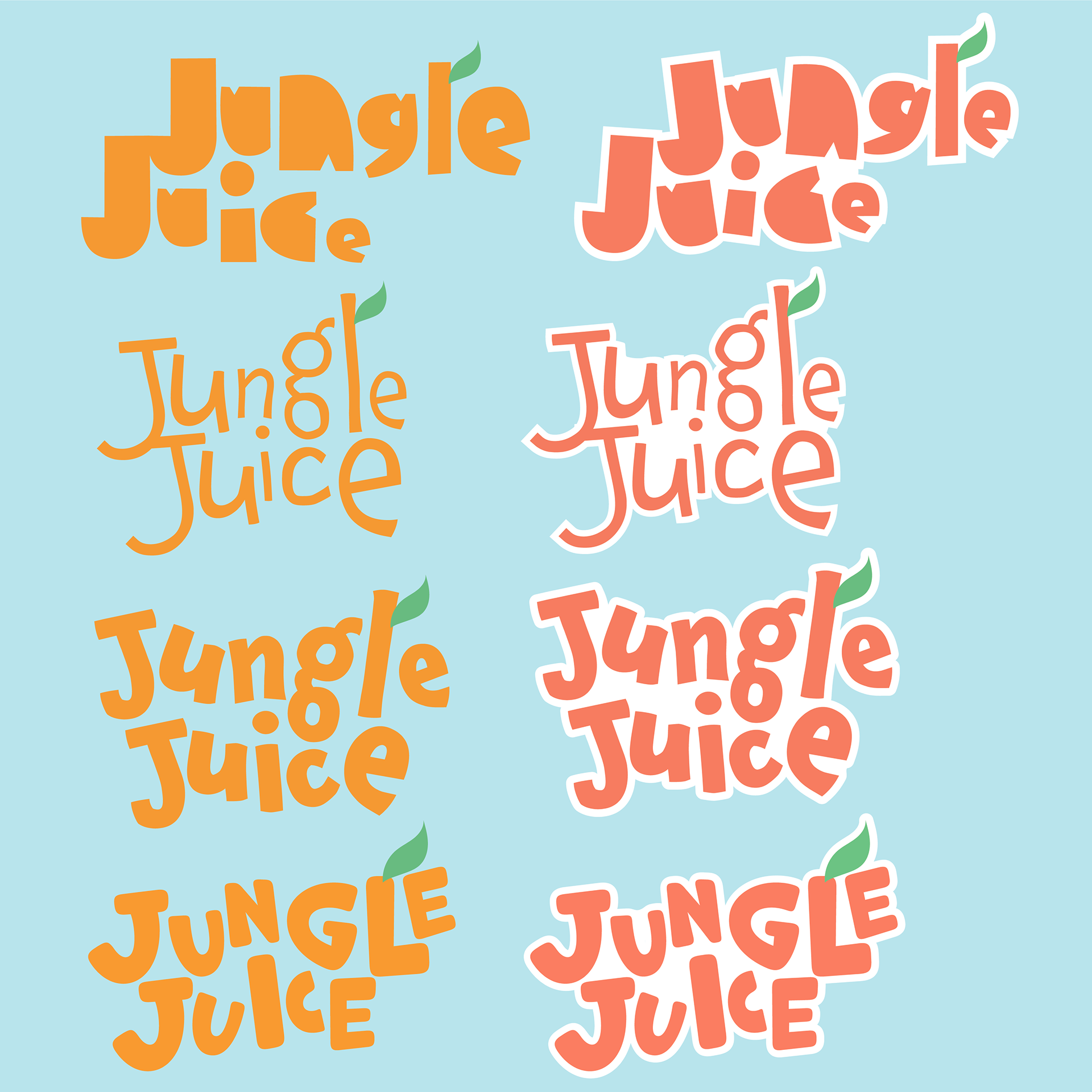
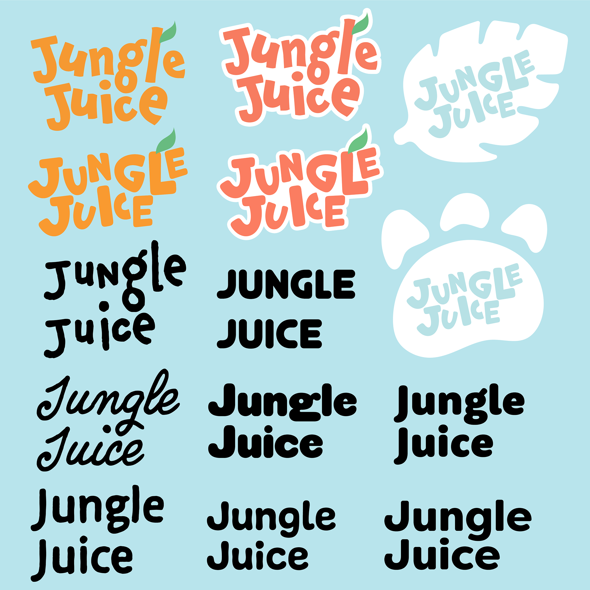
- Be careful when playing with letters in the logo, reads as 'Jungle Juke'.
- Concentrate on the USP as it's a saturated market: Portion of profit goes toward endangered animal conservation / WWF, product will be natural and vegan, emphasise this on packaging to attract parents as well.
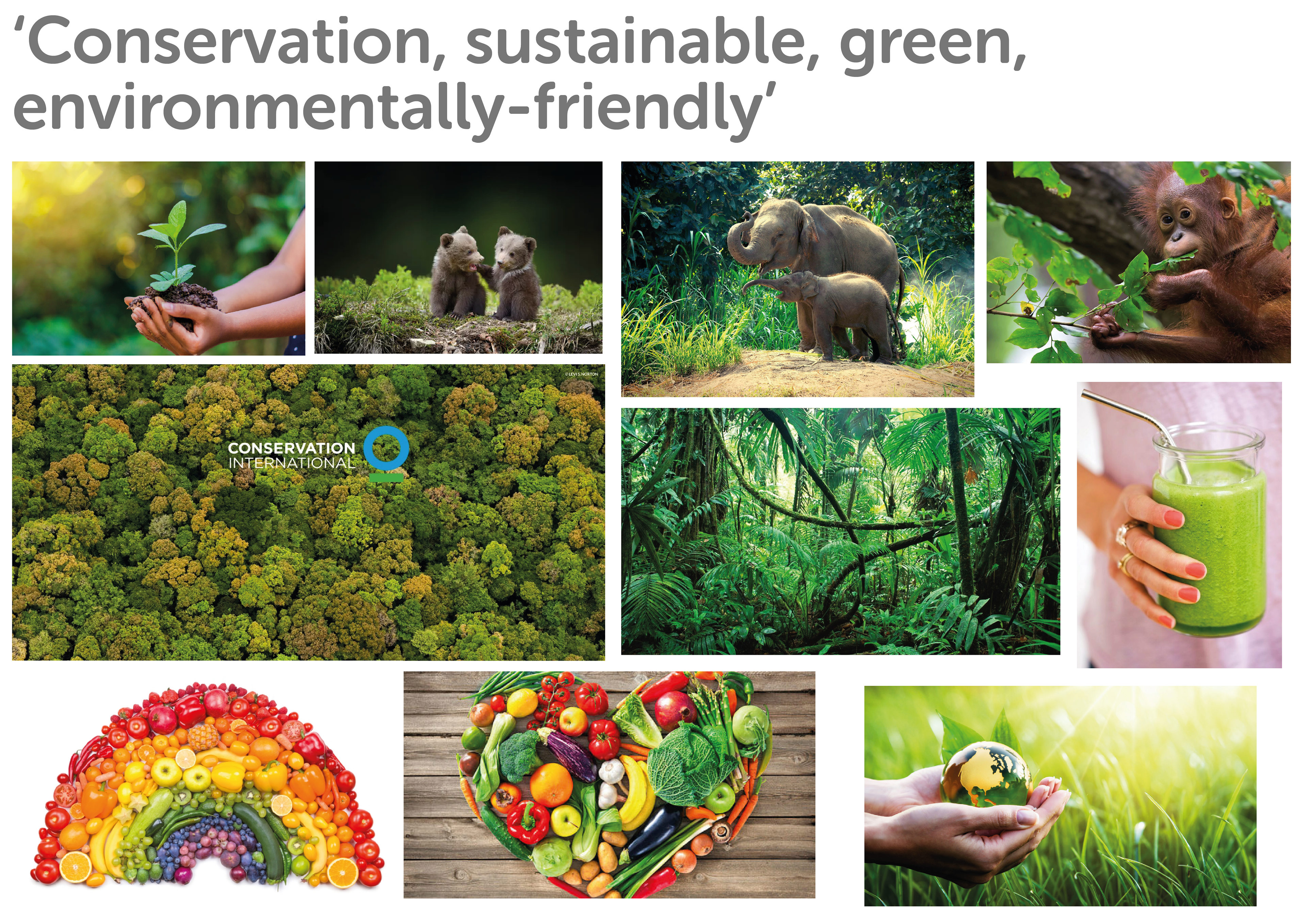
- How can 'conservation' be visualised?
Refined Research & Ideas:
Now I have a more specific idea of what the product will be (lunchbox juices and fruit snacks) I looked at what is currently on the shelves in these specific sections of the supermarket to get a clearer idea of potential competitors.
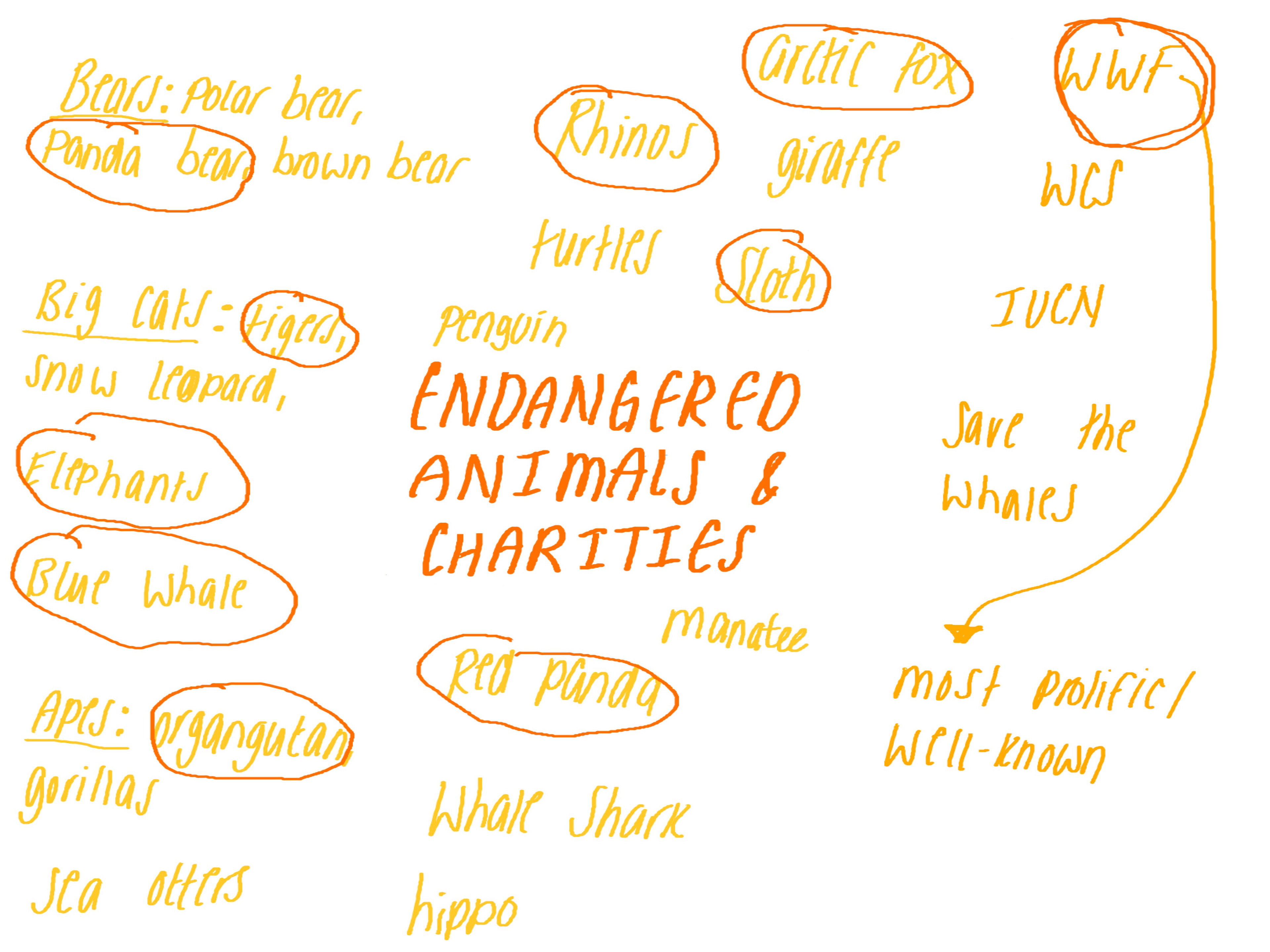
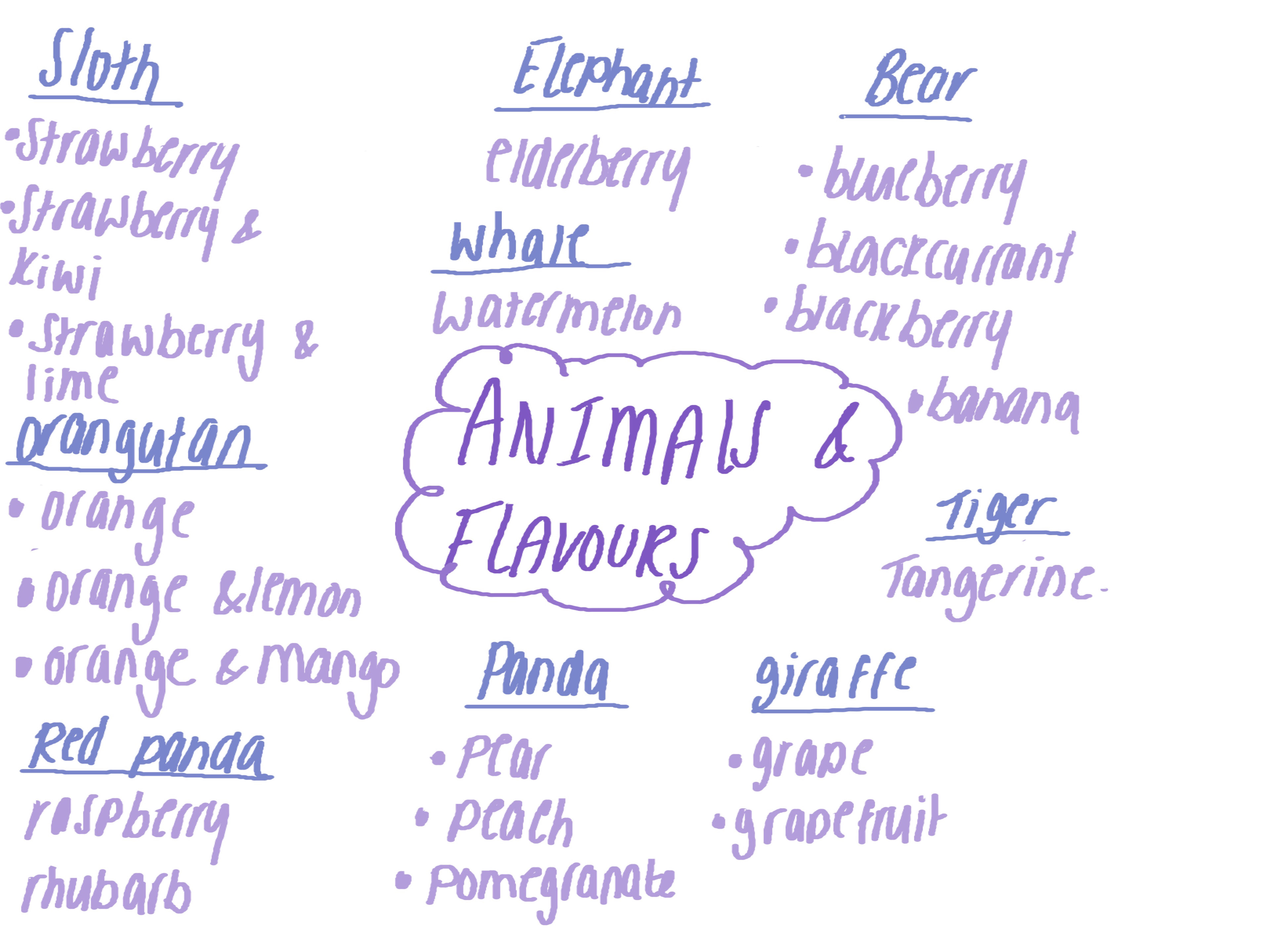
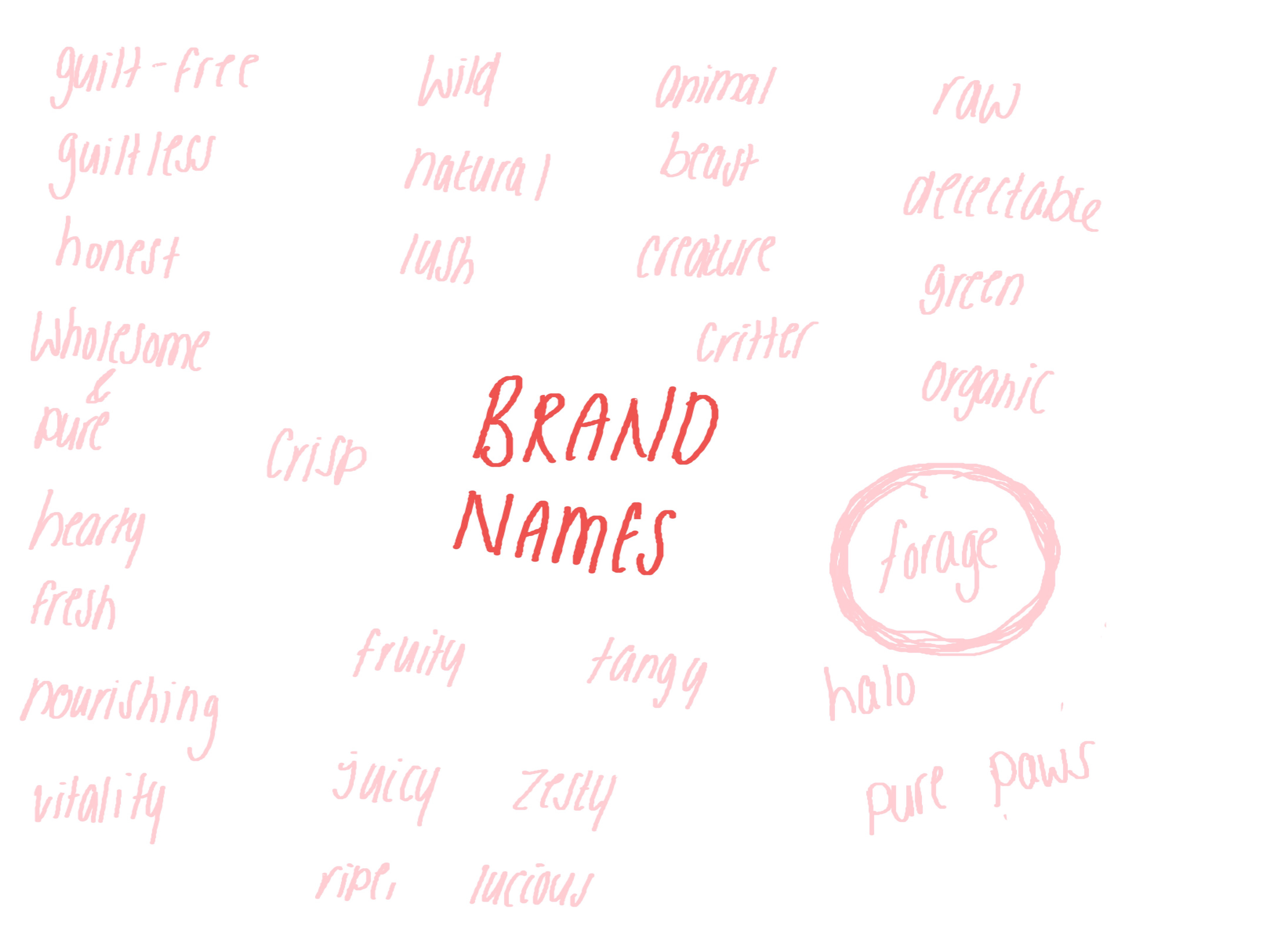
I then considered more names for the products, names that have connotations of being 'good', environmentally friendly, child friendly, healthy, linked to animals etc.
I also researched visual imagery for topics such as being environmentally friendly, and conservation.
I looked at unique packaging shapes and things I could add to the packaging to make it more tactile and fun.
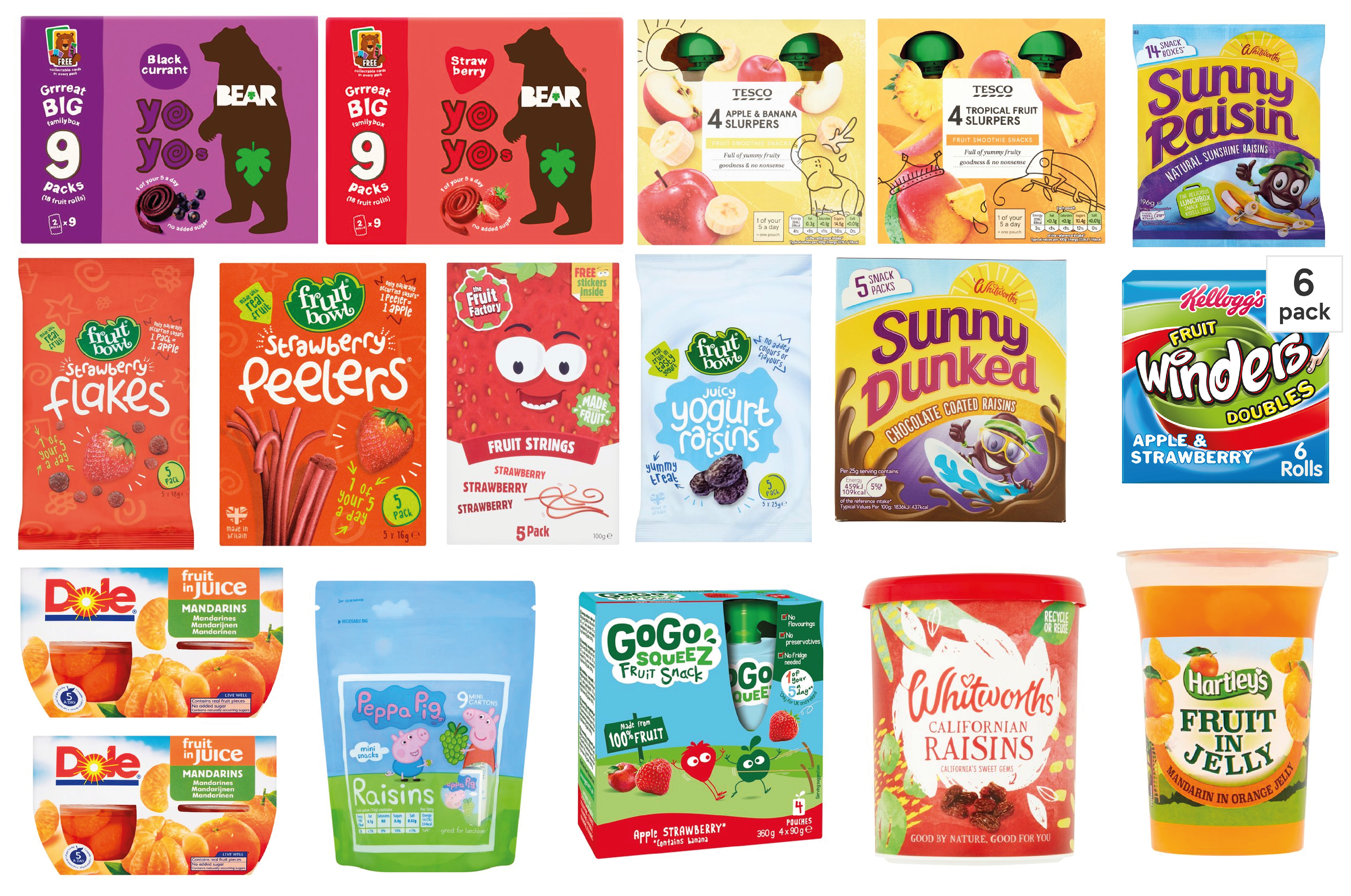
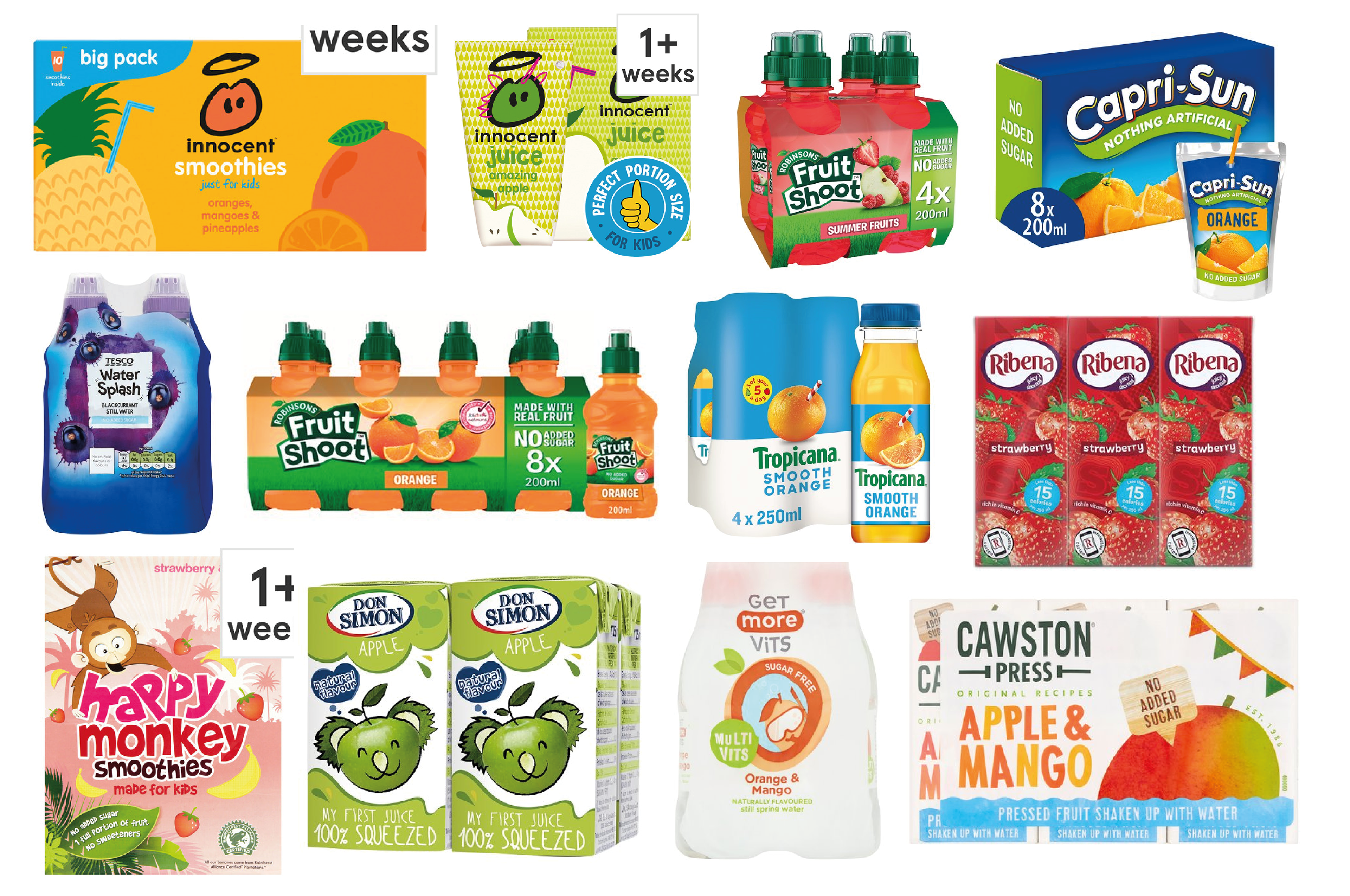
Most 'lunchbox' products come in multi packs so I will need to consider the outer packaging as well as the individual packets.
Common features with competitors to try and avoid:
- 'Busy' designs, not much negative space
- Flat colours, not much texture. I like the textures used on the Crawston Press packaging, and the textured type on the yoyo bear packaging.
- Photographic imagery, e.g. photos of actual product or ingredients.
Final Designs V1
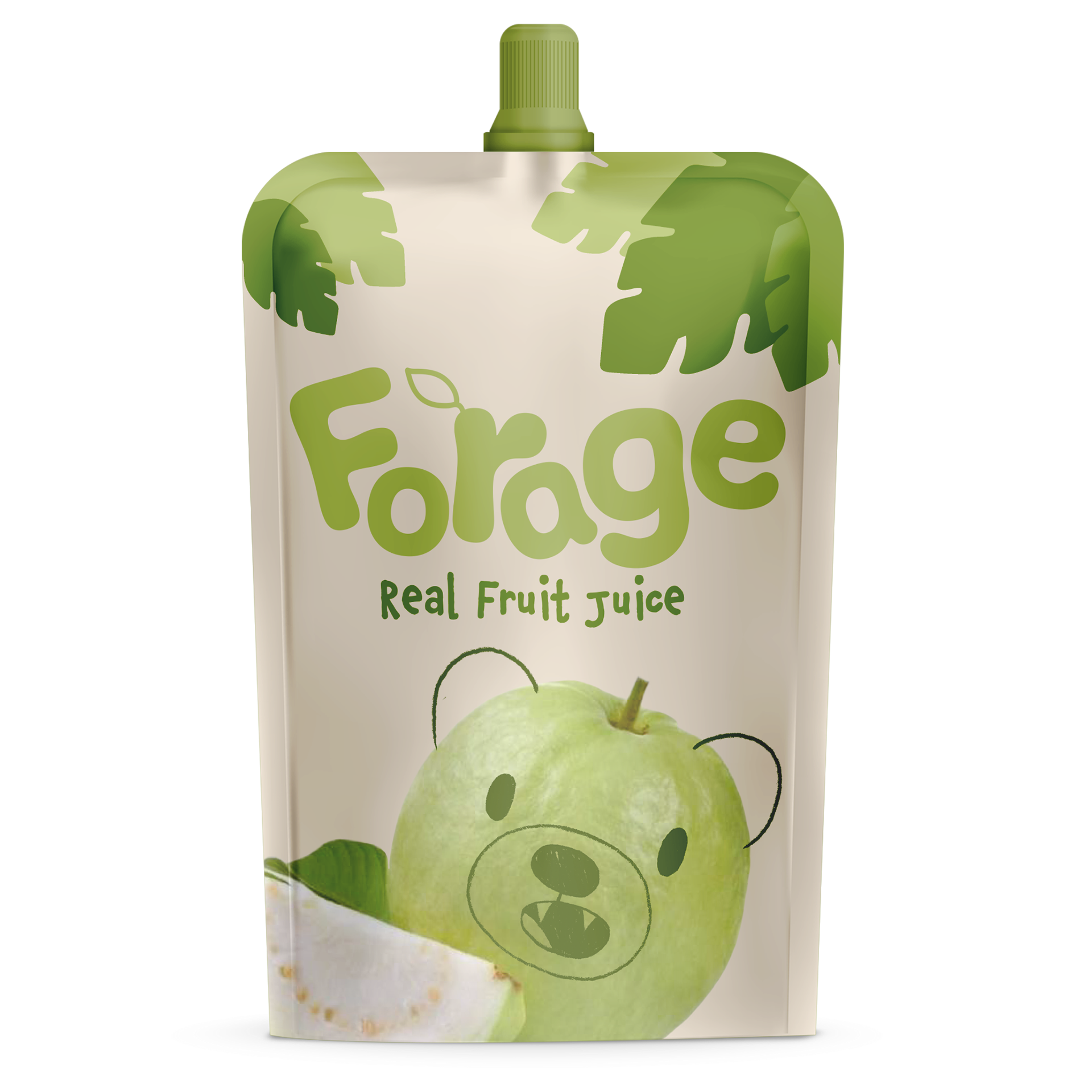
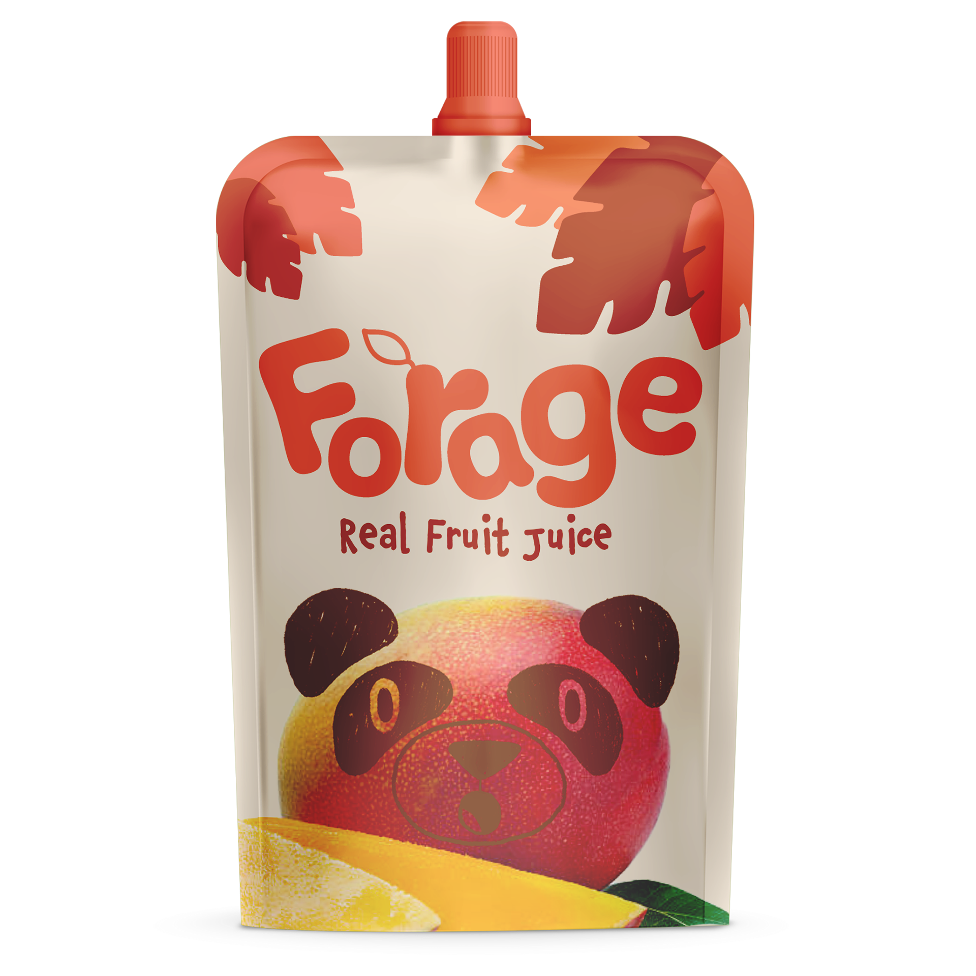
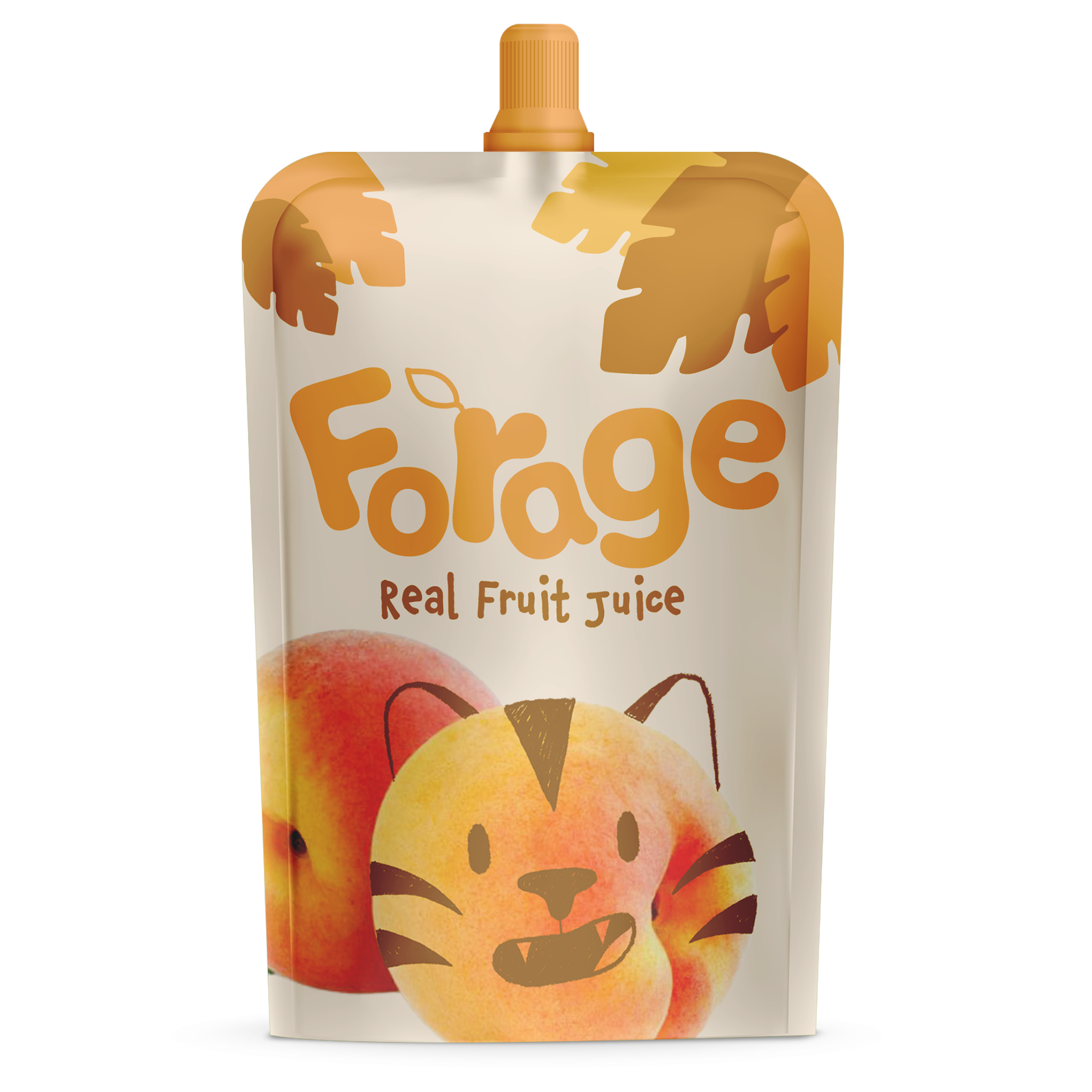
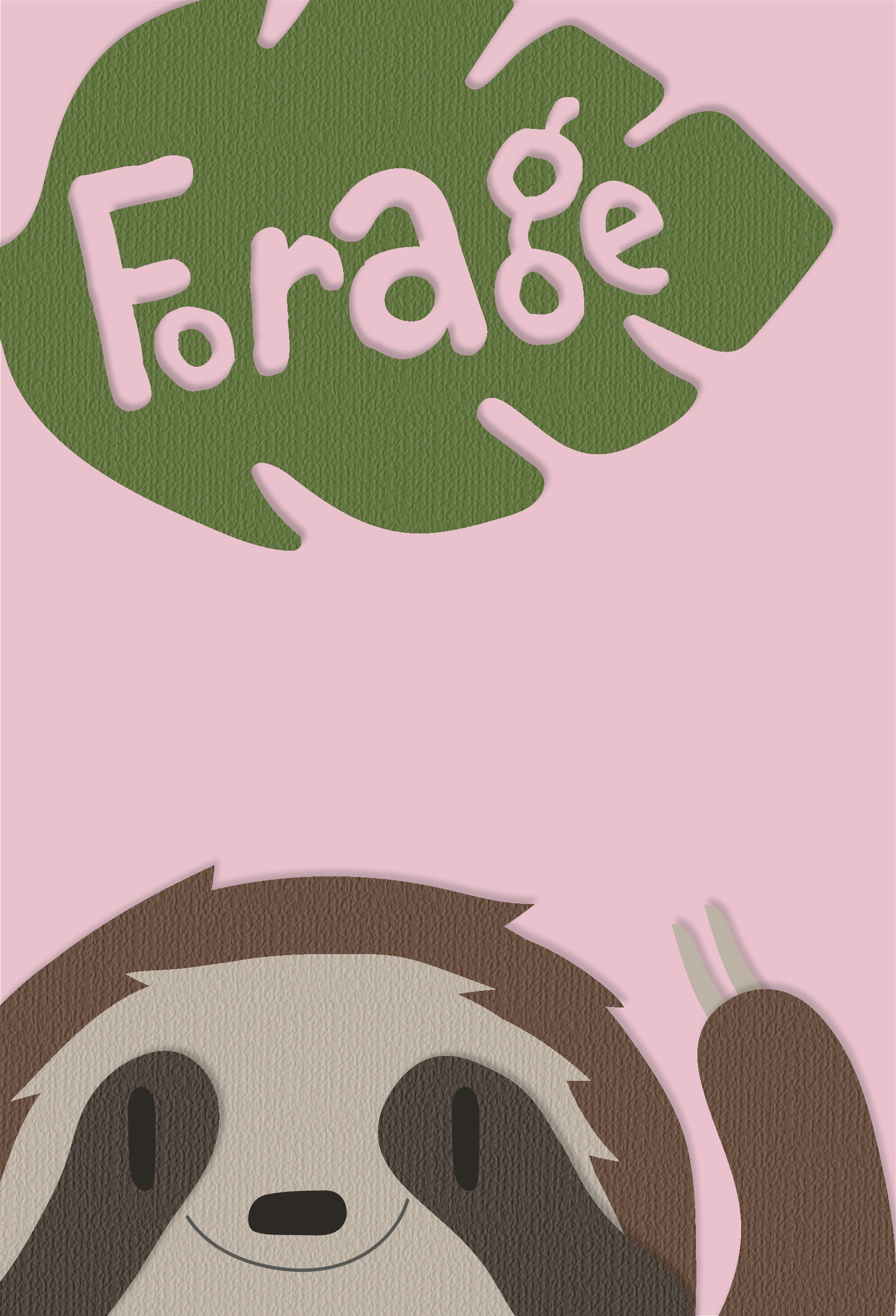
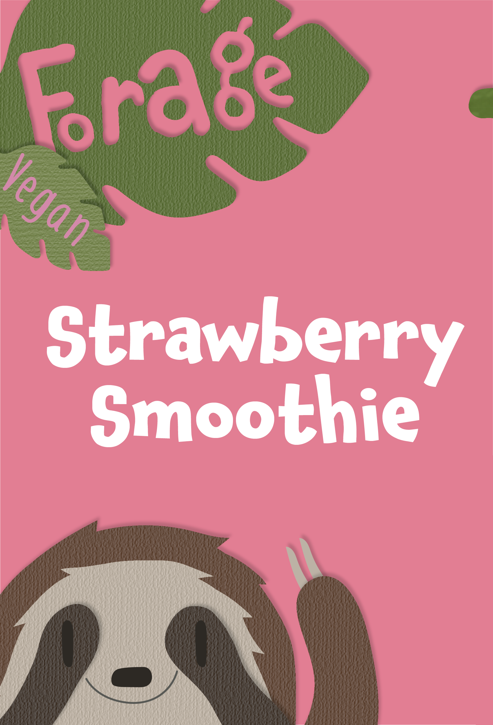
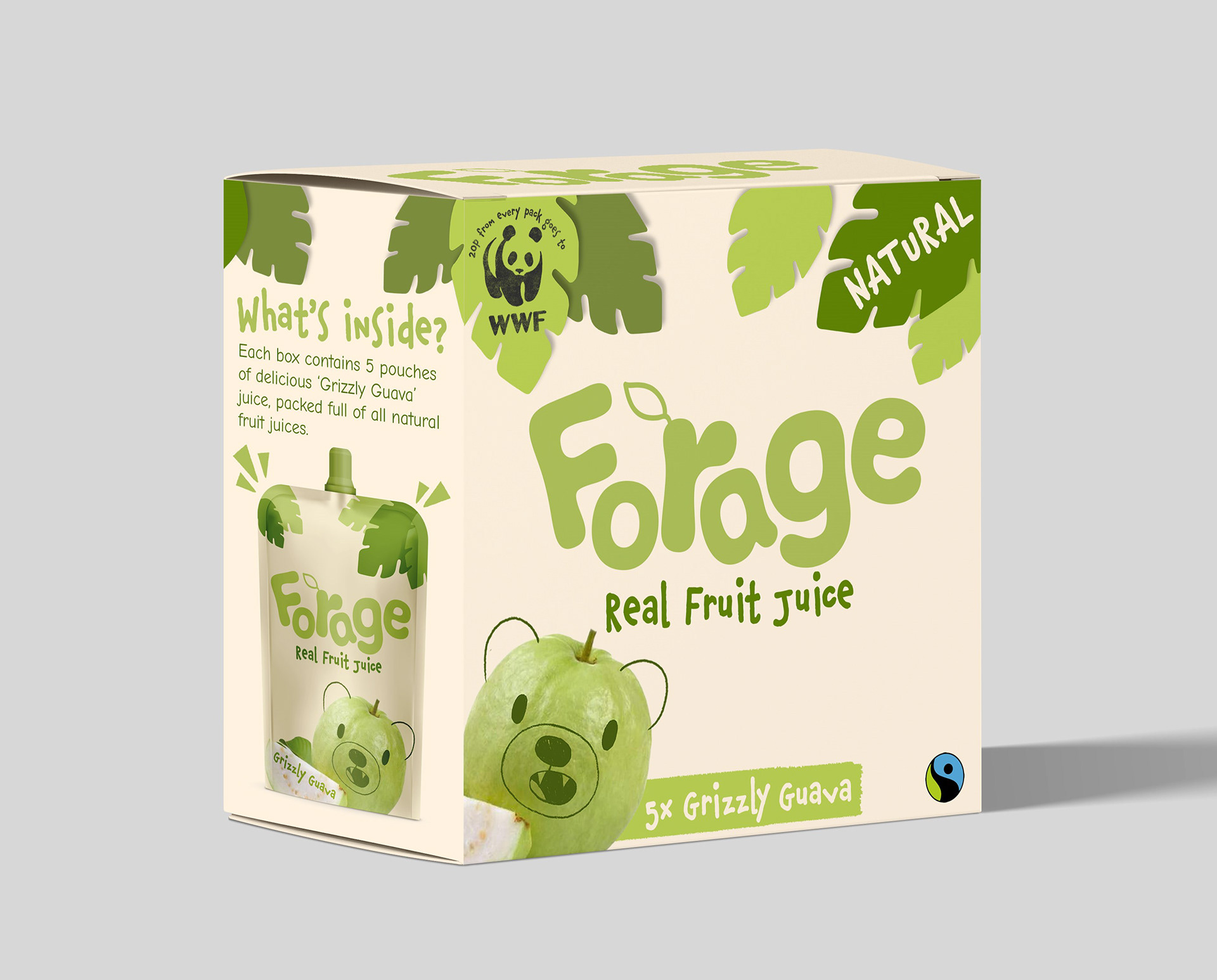
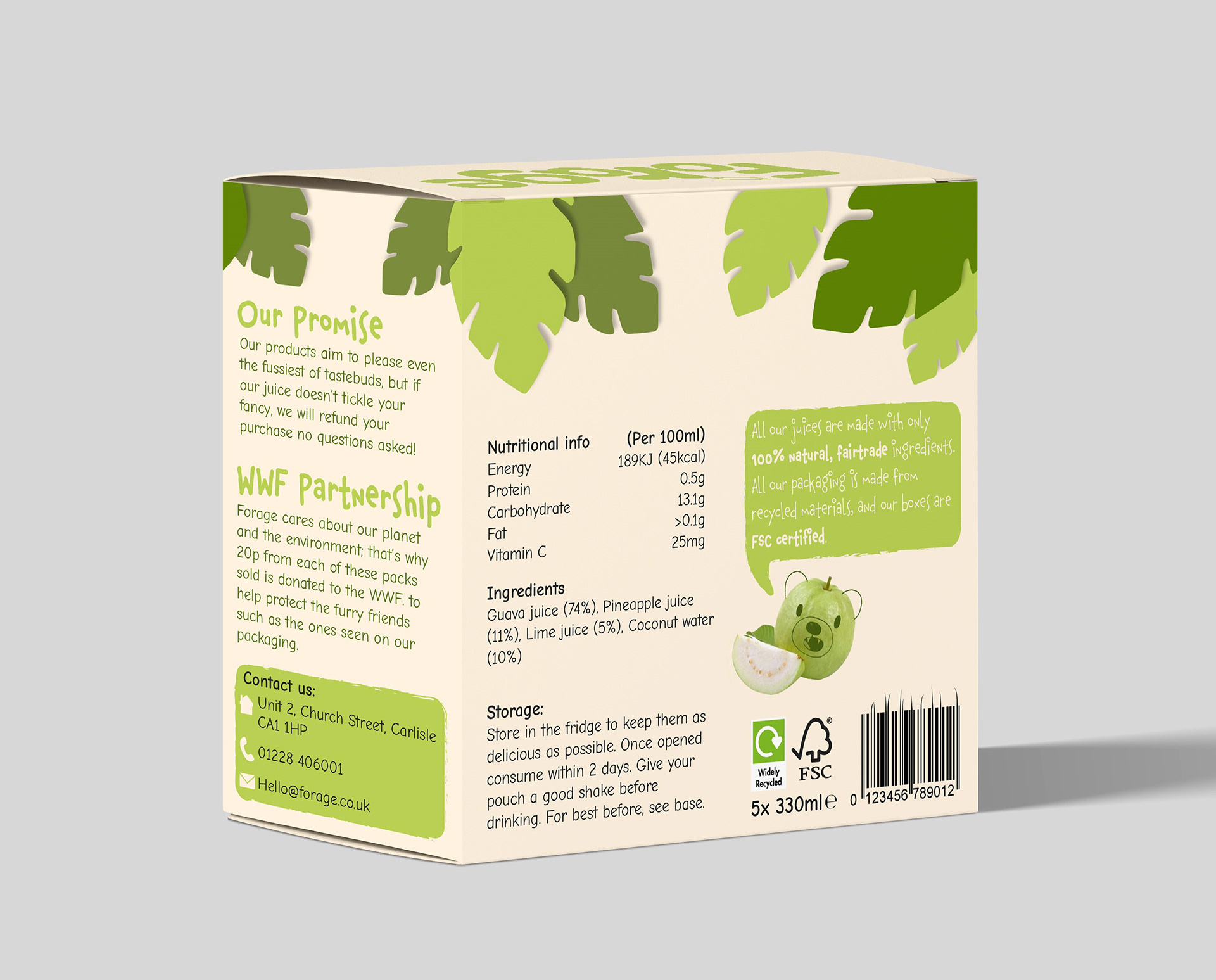
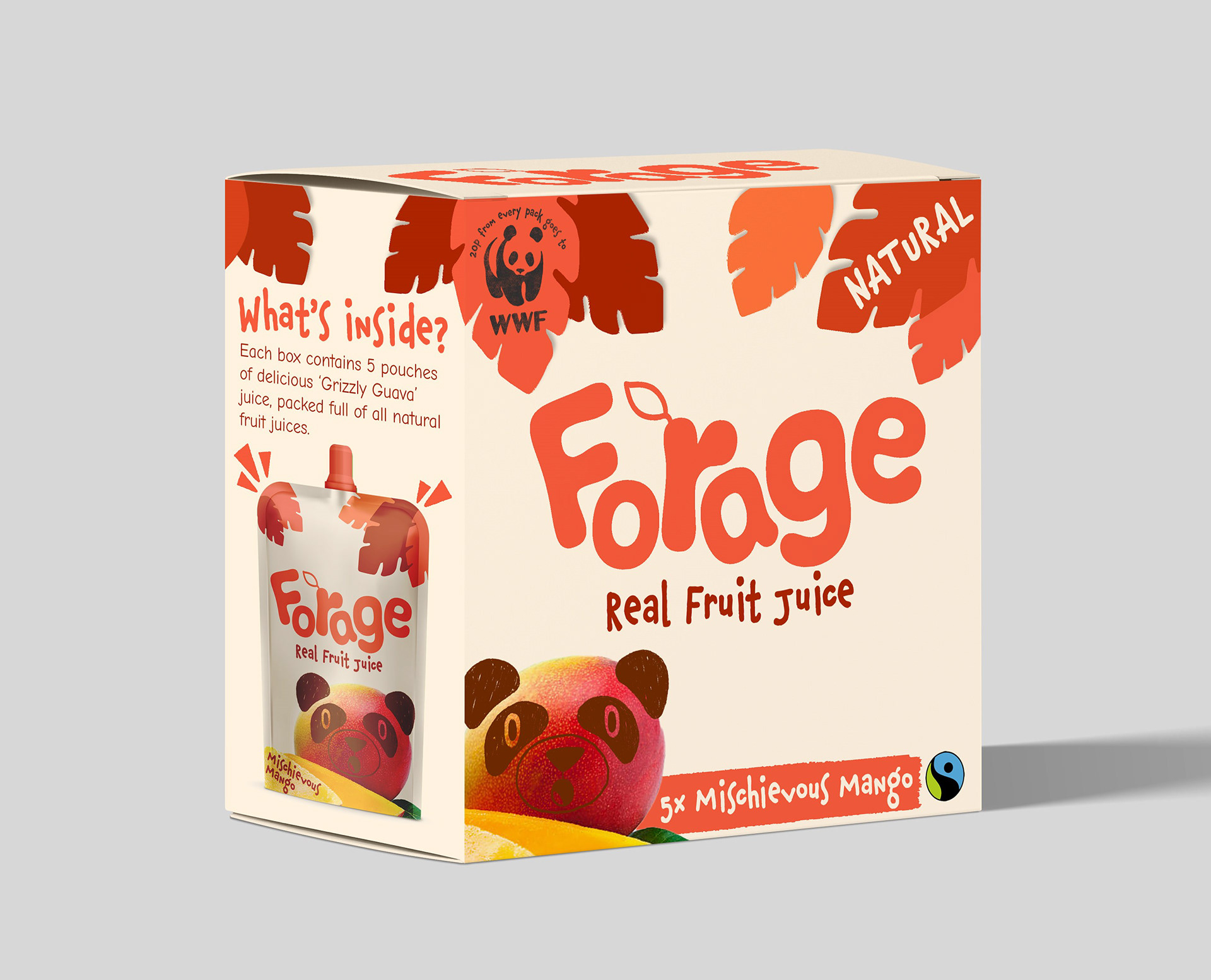
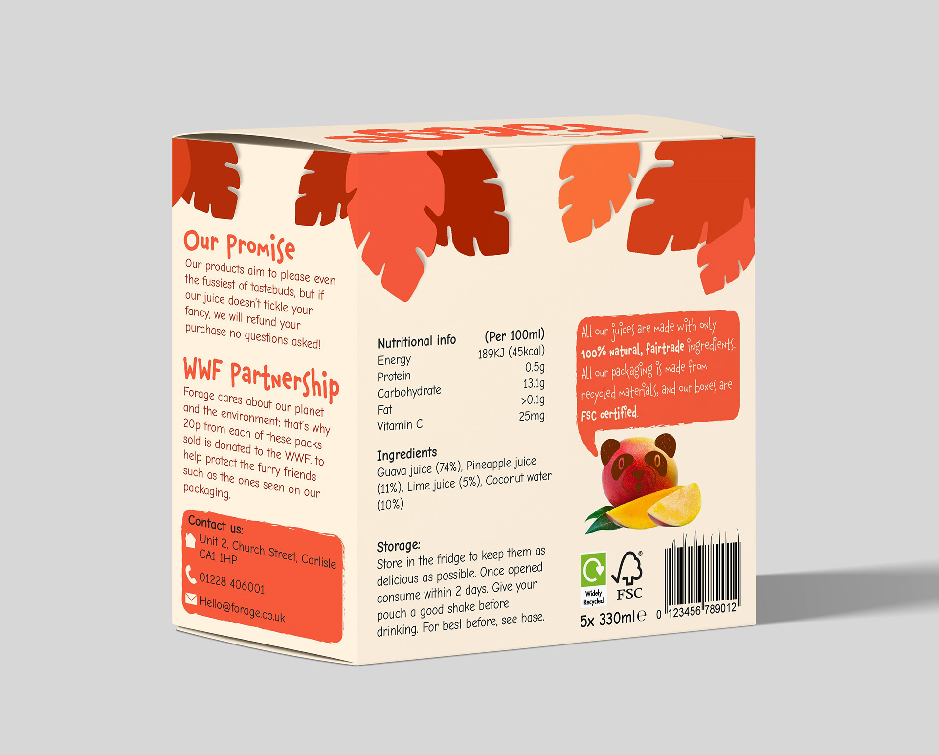
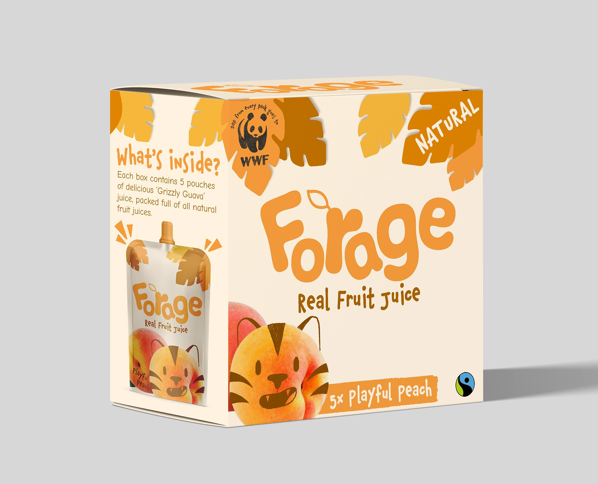
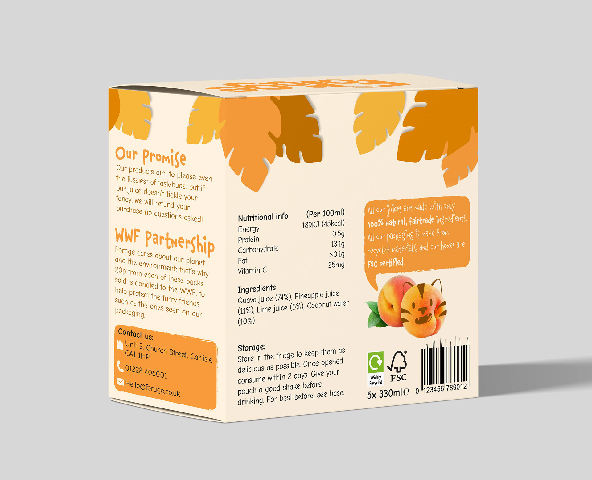
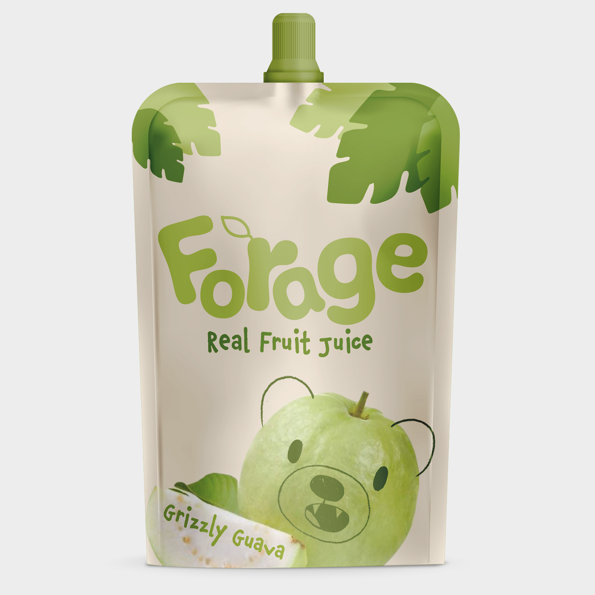
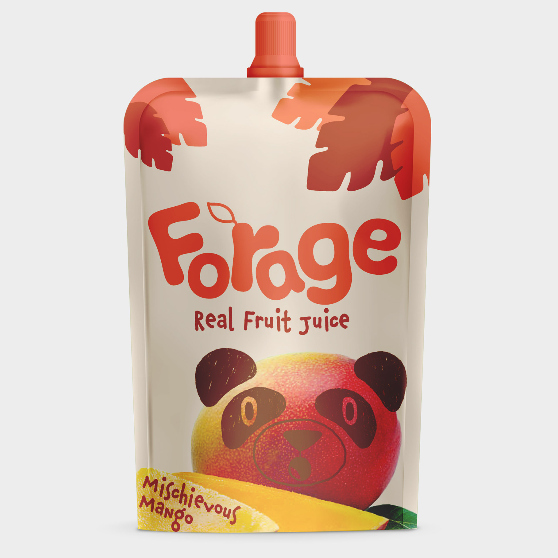
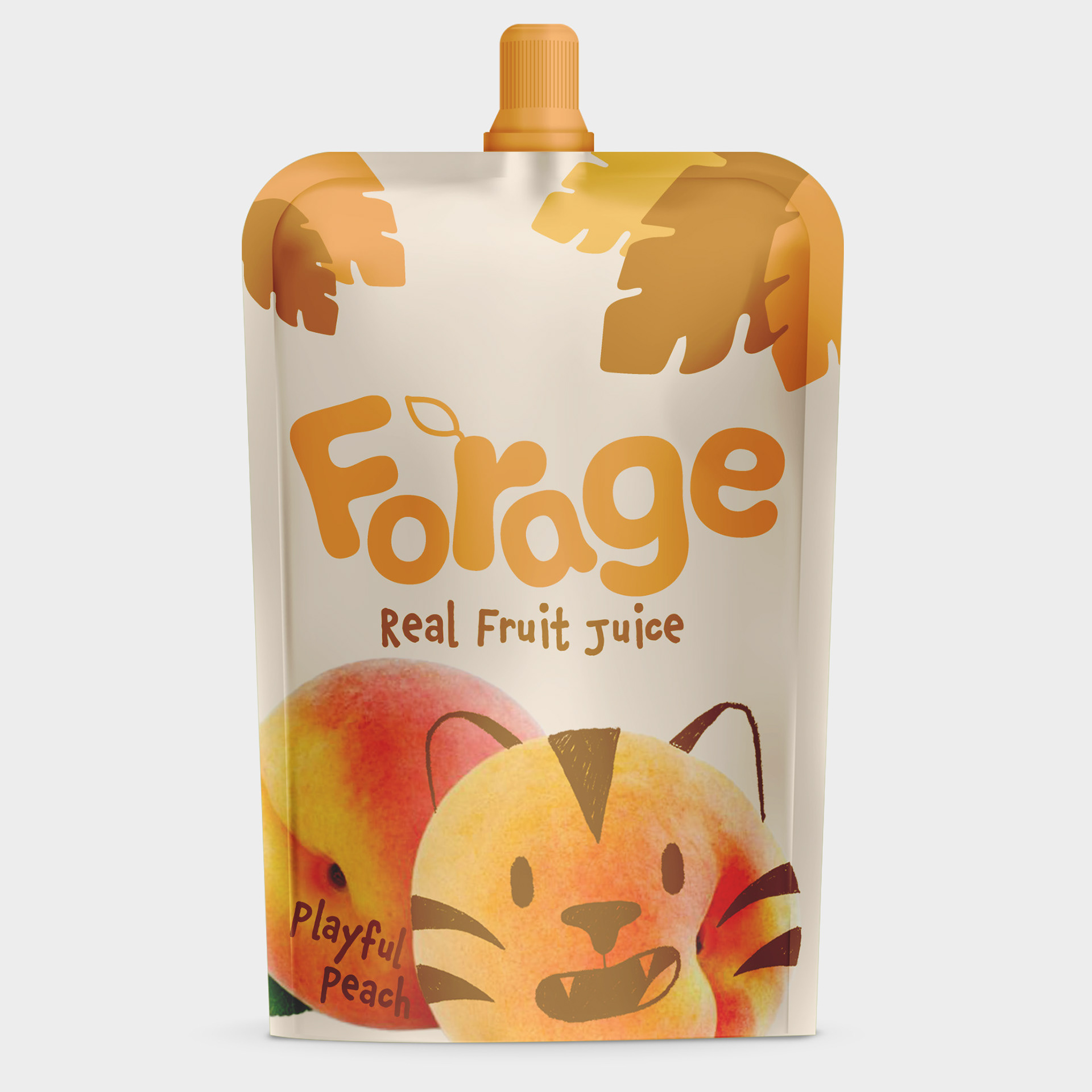
These are the final designs for the product that I came up with. After feedback, I decided on some small refinements to make, such as making the images on the front bigger, as well making the flavour names more noticeable and filling the negative space above them. I also want to make the brand name on the pouches much smaller and make the images and flavours bigger on these too.
These are the final designs for the product that I came up with. After feedback, I decided on some small refinements to make, such as making the images on the front bigger, as well making the flavour names more noticeable and filling the negative space above them. I also want to make the brand name on the pouches much smaller and make the images and flavours bigger on these too.
Final Designs V2
